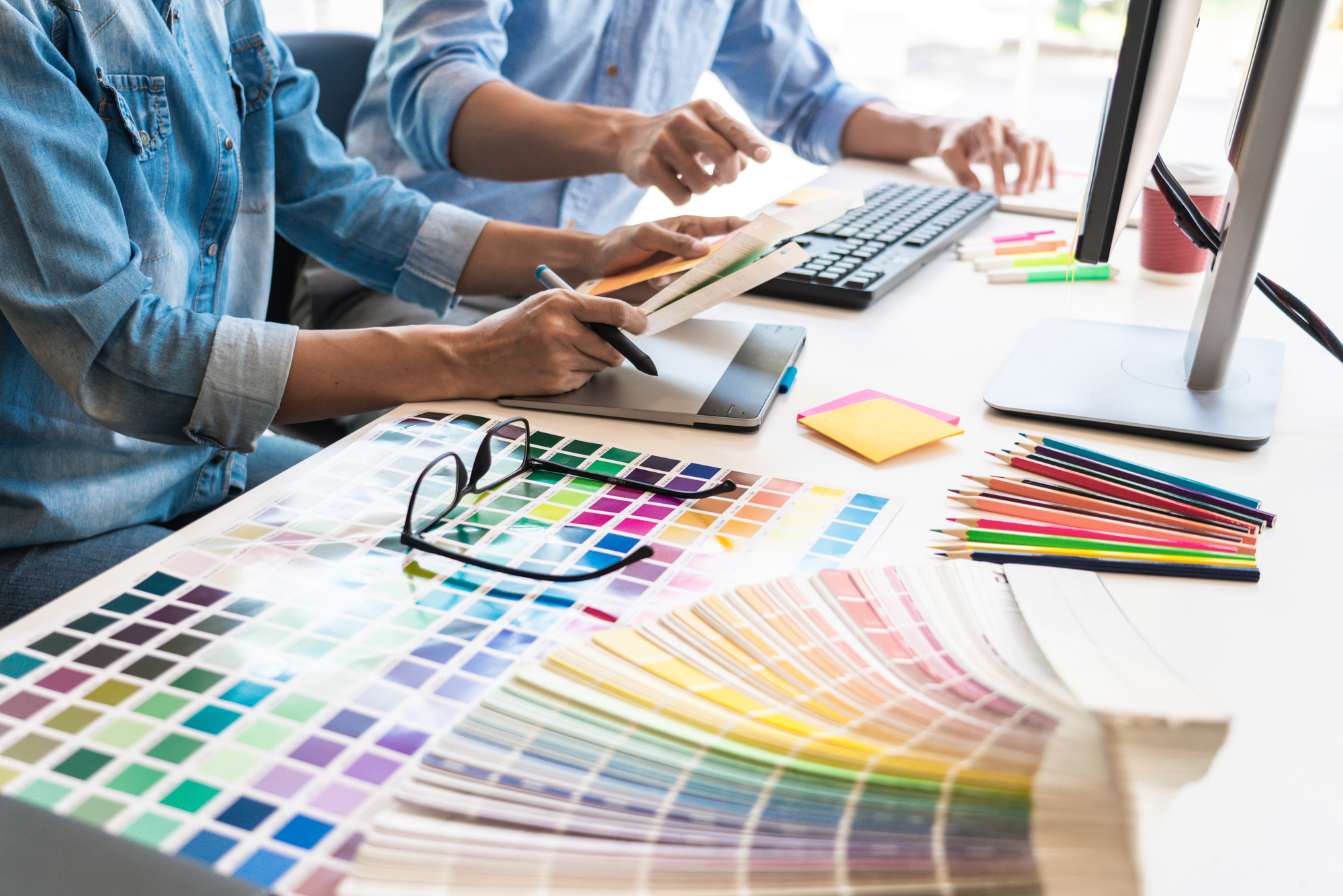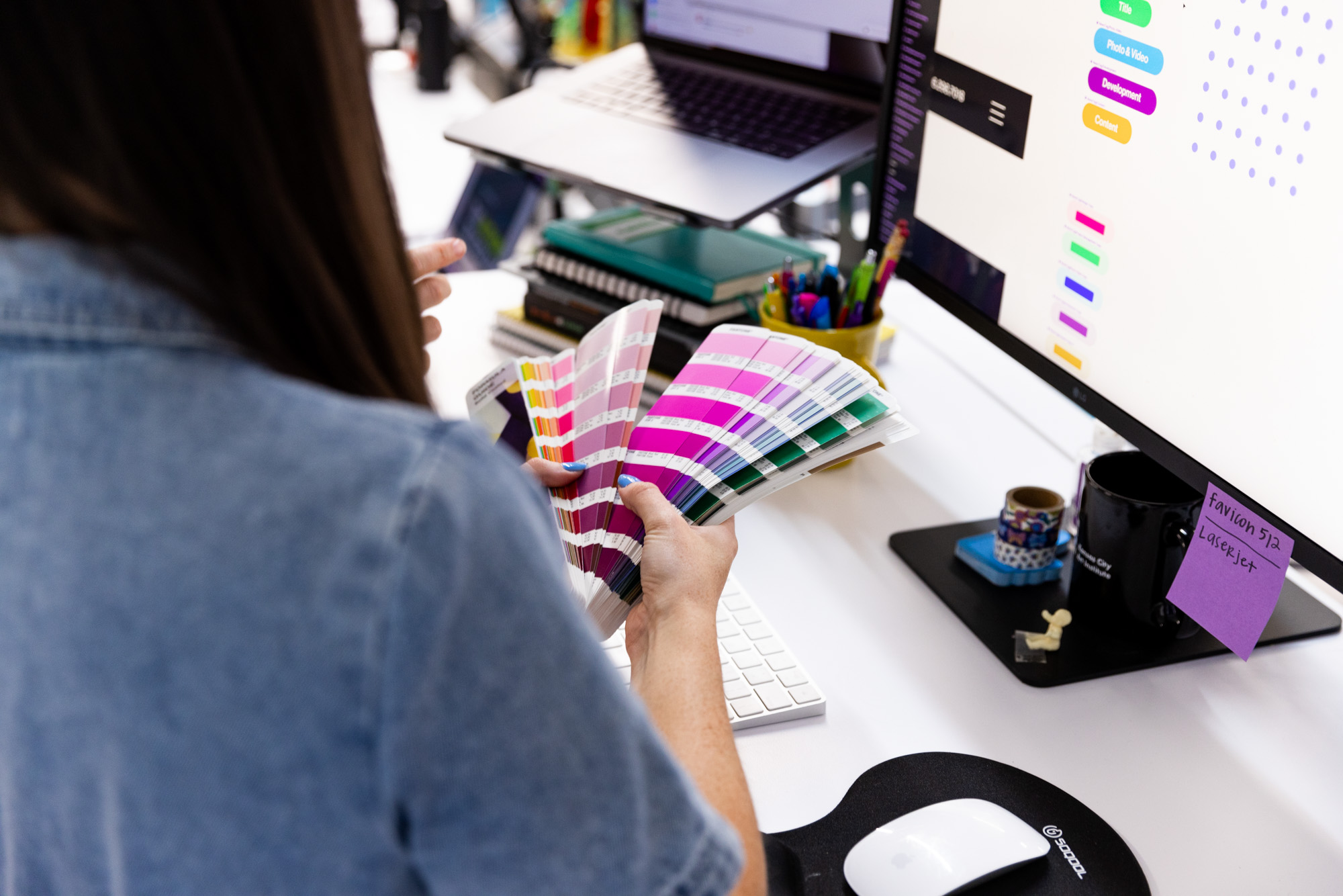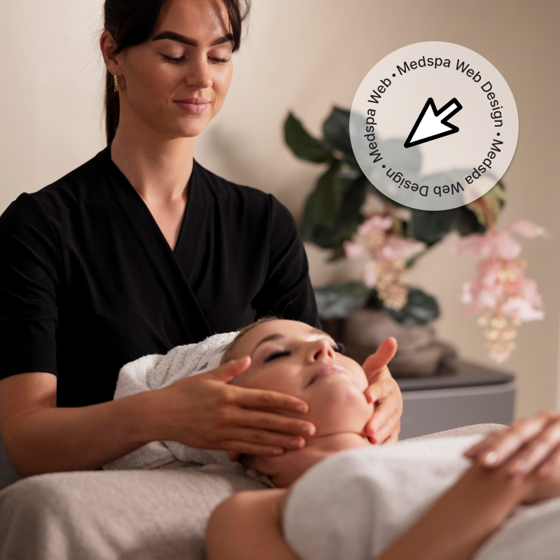
Any good web designer tailors their clients’ websites; your industry, target audience(s), brand guidelines, and of course SEO strategy all combine with high quality web design and development to make the best website possible.
As award-winning web designers with a ton of experience, the team at Lifted Logic has found ourselves uniquely experienced in the digital marketing side of the medical aesthetics industry. As the official web designer for Sciton’s new website and an approved vendor for BTL Aesthetics, we’ve worked with premier medical spas and plastic surgeons all over North America to create some of the best medspa websites with custom features based on our clients’ best interests.
But what takes them from “eh” to WOWZA 😍? Below, we break down the fundamentals of web design for aesthetics practices and deep dive into some of our favorite examples of the best medspa websites.
What makes the best medspa websites?
Usability
Usability means how easy it is for the average person to navigate around your site and find what they need. How simple is it to find things? Where does a user go if they want to learn more about a treatment, like Botox? A good website should be straightforward for any user to navigate.
High-quality content
Great web writing catches someone’s attention. It is also optimized for SEO, meaning it’s written in a manner to help you rank well on Google for your services and treatments. Your content should be straightforward, easy to read, and educational.
Eye-catching design
Your medspa website doesn’t need to be The Louvre, but it should represent the in-office experience of visiting your practice, digitally. The best web design combines design with functionality, showcasing written content in a way that’s straight up nice to look at.
Beautiful photography & videography
A lot of people are visual learners, and seeing what your business, services, and results look like is invaluable for prospective clients.
Our team works with you to discover what to communicate visually, with treatment page video loops, professional headshots, process photos, and more. Users get to see your team in action, providing consultations, treatments, and customer service that works hand-in-hand with your website’s written content and design.
Functionality
Do all the links go to all the right places? Do moving components and animations work as they should? Is there anything funky that prevents a user from getting where they need to go? Quality assurance is key with any web design. No matter how beautiful it is, it should work well.
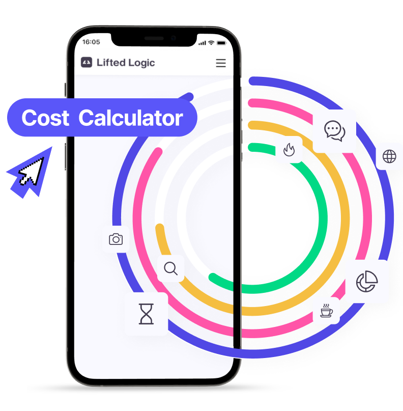
Lead generation tools
Sure, you want people finding your medspa website, but you really want them to become a lead. While every website should have the basics—contact page, schedule an appointment, and a newsletter sign up—there are creative ways your web designer can help generate leads at a much higher rate than your typical contact form.
Lifted Logic employs “gamified” visual contact forms on almost all of our websites. For medical spas, our proprietary Virtual Consultation Tool is the primary lead generation tool for medical spas.
Users select the gender, treatment area(s), and condition(s) to receive a customized list of treatment options. The client receives the users’ contact information in return.
(Want the virtual consultation tool for your website? We can hook you up.)
An overview of the best medspa websites
Let’s nerd out on some of the primary traits that make the best website for your medical spa or plastic surgery practice. Below are 16 of the best of the best, in our humble opinion ✨
Citrine Medspa
Citrine Medspa exemplifies when brand story combines with design to create something unique in the industry.
Branding + Design = Impact
When Citrine Medspa first came to us, they had a different brand name they weren’t excited about. After a brainstorming session within our content team, Citrine is what stood out as the final pick. Once the new name was solidified, citrine as a color became one of the primary focuses for the branding and design of this site.
Located in Lincoln, Nebraska, this medical spa wanted to showcase their modern services through their digital presence. From the colors, custom line drawings, and animations, to the details that make Citrine one-of-a-kind in their community—this medspa website is full of enthusiasm and educational content for users.
Pearlman Aesthetic Surgery
Pearlman Aesthetic Surgery is a high-end plastic surgery and medical spa located on Park Avenue in New York City.
Showcasing expertise and luxury through web design
As a renowned, double-board certified facial plastic surgeon, Dr. Pearlman wanted his new website to convey the high level of care, expertise, and luxury of his office, where he works with another plastic surgeon and a full team of aesthetic providers.
The style of this plastic surgery and medspa website is what we call “editorial,” with sleek animations, custom components to organize content, and hover features over photos, taking pictures from black and white to full color.
Pearlman Aesthetic Surgery’s website also features a customized rhinoplasty consultation tool, where users can learn more about the possibilities of their procedure instantly.
This tool asks a series of questions to learn about the prospective patient’s circumstances and give them insight on a rhinoplasty technique that may suit their needs. This visual contact form also doubles as an online lead generator for the practice.
Entre Nous Aesthetics
Entre Nous Aesthetics is a medical spa located in Menlo Park, California. “Entre Nous” is French for “just between us,” and this notion carries throughout their site to show their clients that they’ll be well taken care of in the privacy of their offices.
Playful medspa website design
The font choices and color scheme of the website keep a playful tone that still conveys the high-end feel of Entre Nous Aesthetics. From the golden cursive lettering, to the color change of heading on instances of “EN” (shorthand for Entre Nous), this website speaks perfectly to its target audience.
LIV Wellness Lounge
LIV Wellness Lounge, with locations in LaSalle and Ottawa, Illinois, has a unique take on what a med spa can be. With this idea driving their physical location design, we carried this through to create the best medspa website possible.
Luxurious design meets approachable content
A casual tone that still conveys their expertise throughout the written content. The LIV Wellness Lounge website features clean lines, bold fonts with varied sizing, and fun custom animations.
Our designers were heavily inspired by LIV Wellness Lounge’s beautiful office, particularly their front desk area and wallpaper throughout. We combined this colorful look and feel with digital assets to match their brick and mortar location.
Central Park Beauty
Central Park Beauty is a medical spa in New York City whose name echoes a special connection with its surroundings.
Educational content on treatments and conditions
A great tool for medspa websites is a filter that helps users search through the website by either the treatments offered or treatable conditions. On Central Park Beauty’s website, their navigation nicely organizes this information for users to pick the way they want to browse the site content.
Users who filter through the website by condition get an overview of that specific concern, what causes it, and treatment options available at Central Park Beauty.
Envision Eye & Aesthetics
Envision Eye & Aesthetics is a medical spa in Rochester, New York led by the talented Dr. Katherine Whipple. As a cosmetic and reconstructive oculofacial plastic surgeon, she offers highly specialized oculofacial surgery and aesthetic services.
A multifunctional medspa website
Because there are two sides to this business, the website offers a static navigation at the top right corner of every page to easily toggle between Aesthetics services & Eye Surgery content.
This medspa website has versatile components that split up information, making it easy to read while keeping visual interest with photos throughout.
Callouts to some of their top procedures are easily accessible on the homepage, giving a brief overview before inviting the user to learn more.
Levitt Medical Aesthetics
Levitt Medical Aesthetics is a medical spa in Albany, Oregon and is a premier aesthetic provider in their region.
Breaking down medspa treatment information for easy reading
To demonstate the breadth of services and expertise level, the Levitt medspa website design included components to house information in short, bite-sized pieces. This allows users to easily read through that content and learn about each treatment.
Every treatment page includes highlights, details, benefits, and frequently asked questions for a comprehensive-yet-quick overview.
Enhance Med Spa
Enhance Med Spa’s website design is particularly unique in showcasing 3 separate locations (Hampstead, Southern Pines, and Laurinburg) that each offer different services.
A multi-site done right
To create the best user experience, we built an option to easily navigate between the 3 locations so users can easily find their correct location and know where they’re at at any given time.
Each location’s homepage gives a comprehensive overview of their services for aesthetics, wellness, primary care, and skincare products to help users easily filter through the site.
Each page on the website features the same calls to action encouraging users to reach out. This gives those who are ready to book an in-person appointment an easy way to do so (including through the top navigation) and also provides an opportunity to those who want to keep researching online through the Virtual Consultation tool.
Perlis Medspa & Wellness Center
Located in Highland, Illinois, Perlis Medspa & Wellness Center is another business that does “a bit of everything” when it comes to their services.
Helping users easily navigate services and shop online
Since this medspa has two primary sides (Aesthetic and Wellness), the homepage calls out both of them with this custom component, allowing users to see a preview of popular procedures for each.
Some of the best medspa websites have e-commerce functionality, where they have an online store that is easy to browse.
Product pages allow shoppers to add the desired quantity of a product to their cart, add to their wishlist, or email to a friend (or themselves for later!). If the user scrolls, the page pulls through related products based on the product page.
Renew Aesthetics
Another medspa multi-site for 3 separate businesses under the same umbrella is Renew Aesthetics. This site has easy navigation between its 3 business entities—Renew Aesthetics, The Edge, and Ozark Regional Vein & Artery Center—at the top right for users to see at any time.
Explaining processes easily
Some of the most common questions a medical spa gets are about the process of the treatments themselves. (How many times have you heard “How does this work? How much does it cost? Does it hurt?”)
This website breaks down each treatment process in a click-through component. This component minimizes large chunks of text on the page while still adequately indexing for SEO.
PURE Medical Spa
PURE Medical Spa is located in Boise, ID, and includes some unique features within their site content.
Helping users filter themselves through the site
One of our favorite parts of PURE’s homepage is the below component that lists treatment options by age.
Users can look through the most popular treatments for their age range to get a general idea of what treatments may best suit them. This information goes from the 20s through 60s+ to accommodate all of their audiences.
Medical Aesthetics & Laser
Located in Shenandoah, Texas, Medical Aesthetics & Laser’s medspa website is minimal and clean, featuring engaging, to-the-point content and minimalist design.
Showing personality through your team page
One of the best ways to show users your personality and “put a face to the name” is through a great Meet the Team page. On this website, you can browse all of MAL’s aesthetics team members to learn about each provider. When you click on a team member’s photo, a pop-out comes up with an in-depth description of that provider’s background, education, and experience in the field.
TLJ Aesthetics MD
TLJ Aesthetics is a medical spa in Issaquah, Washington. Their website design took inspiration from their location’s beautiful surroundings of the Pacific Northwest. With greens and neutrals as the primary color palette and botanical graphics throughout, users have natural beauty top of mind with this medical spa’s website.
Showcasing before and after photos
One of the most integral ways medical spas and plastic surgeons generate leads online is through high-resolution before and after photos.
TLJ’s website has a component on every treatment page where they can set the before and after photos that populate for each page. Arrow icons help users easily scroll through before and after photo sets to help them envision their own results.
Medical Aesthetics
Medical Aesthetics is a med spa in Ann Arbor with a highly visual site that engages users. Many of their design components include options for written content, icons, and images so all types of learners can easily understand the information presented.
Making a site visual and easy to use
One of our favorite design elements on this medspa website is this left/right that lets users scroll through their most popular procedures. Located on their homepage, this gives the practice a place to update and highlight their high-focus procedures. Users get a quick overview of this medical spa’s specialities, with the option to keep scrolling through the list or clicking “Learn More” to navigate to that treatment’s page.
Cellulite Physician Services
Cellulite Physician Services is a practice in Kansas City with one of the most niche specialties: cellulite reduction. Though their focus is on one condition, they understand the complexity behind cellulite and solutions to improve it.
Highlighting specific information
To show their breadth and depth of knowledge, their medspa website design has plenty of components that break down the science behind their treatments.
A scrolling photo gallery allows the practice to show off their team, offices, and services while inviting the user to learn more about their processes as a cellulite specialist.
Where does SEO fall into all of this?
You can have the most beautiful website *ever* but without SEO, no one will find you. SEO stands for Search Engine Optimization. This strategy helps your site rank well on search engines, particularly Google, to drive relevant traffic to your website.
For example, if your practice has wrinkle treatments in Omaha, you want to show up for people who search wrinkle treatments in Omaha. This is a simplistic take on SEO, but it’s the general concept. You want your website to show up for the most popular words and phrases your clientele uses to search for providers. Not only this, but your SEO efforts should match user intent.
Lifted Logic owner and founder, Adam Fichman, explains how we use SEO ranking and keyphrases to help our clients grow their businesses through their digital presence:
As a seasoned digital marketing agency, Lifted Logic is well-versed in white hat SEO. We play by the rules, practice patience, and yield real results for our clients.
Lifted Logic designs some of the best medspa websites.
We make websites that are more than just a pretty face. Your website can be your best salesperson, and through high-quality SEO content, expert web design, lead generation tools, and industry experience, you can empower the growth of your business through a killer website and digital marketing.
Lifted Logic offers a free SEO or web design evaluation for med spas, plastic surgeons, and other aesthetic providers. Through free client education, we continue our mission to promote high quality web design for businesses in all industries. At the end of the day, we simply love what we do and even more, we love sharing it with others.
Lifted Logic
Lifted Logic is a team of creative writers, designers, developers, and photographers who specialize in digital storytelling. As a leading web design company in Kansas City, Lifted Logic works with hundreds of small, medium, and large businesses across the country every year.