If we showed you a piece of art next to a piece of UX/UI design, would you be able to tell one from the other? I’ll give you a hint: UX/UI design is the one that gets you to do something or solves a particular problem.
The best design is the kind that goes unnoticed. It doesn’t get in the way of your understanding of the subject; rather, it blends in seamlessly to enhance your experience.
As professional designers, we aim to get in the shoes of our client’s customers and walk around for a while. We’re almost psychologists. What are their thoughts? How do they feel? What do we want them to accomplish? What cognitive processes do they go through before making a decision?
The best way to start thinking about UX design? Begin with the basic UX laws every designer needs to understand.
1. The Aesthetic-Usability Effect
“Users often perceive aesthetically pleasing design as design that’s more usable.”
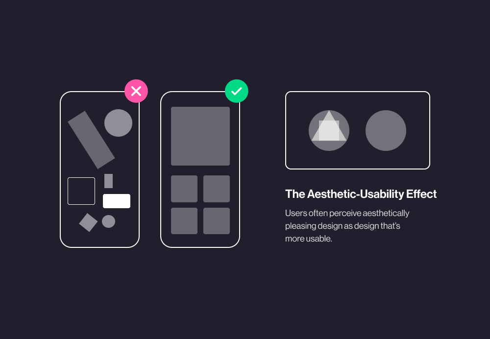
Just like the Halo Effect, where people perceive attractive people to be good people, the Aesthetic-Usability Effect means the more pleased your eye, the happier you are to use the design.
Now off the bat, this seems like a positive thing, right? Of course it’s great when it works in real life (think Apple products), but the Aesthetic-Usability Effect also means that when you perceive a website as aesthetically pleasing, you also think it is more useful and works better, even though that may not always be the case.
This gets to be a real pain when trying to run usability tests. People become so wrapped up in the aesthetics of the design that they miss minor usability errors or only report how much they loved the color scheme in their usability assessment of a website.
It’s really important that web designers are aware of the Aesthetic-Usability Effect to understand feedback from user research. Obviously, major usability issues won’t go unnoticed, but there’s a chance a participant who heavily focuses on aesthetics has missed minor usability errors.
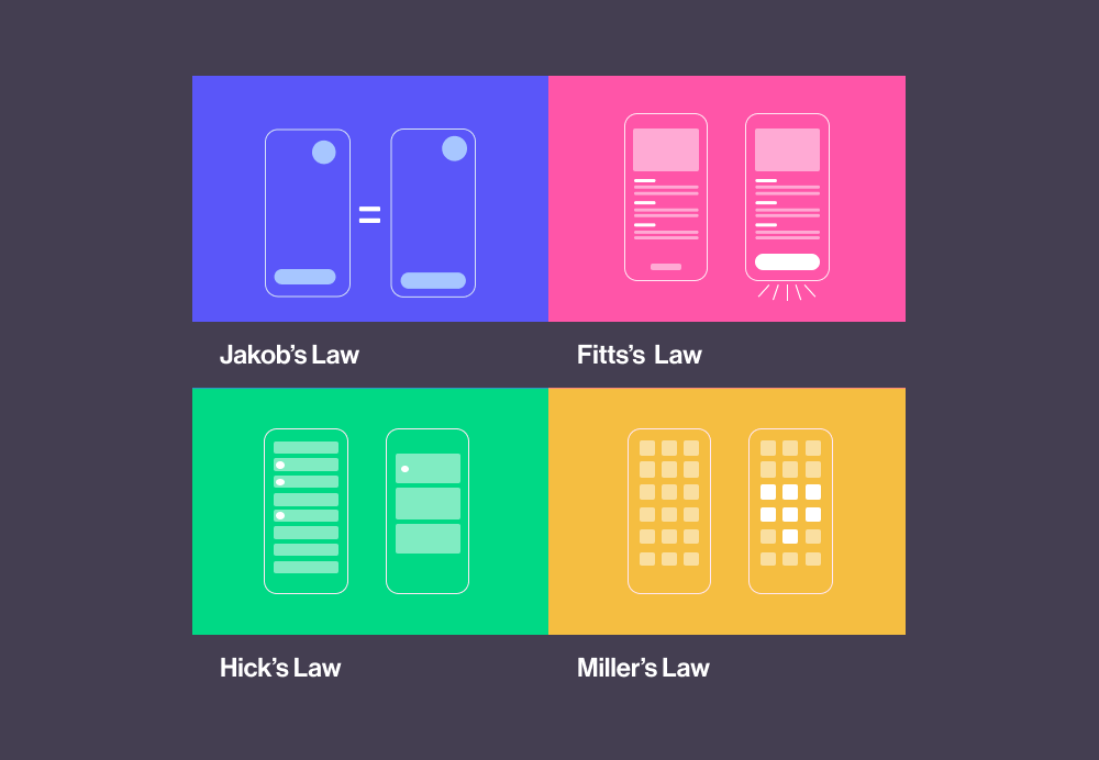
2. Jakob’s Law or The Principle of Familiarity
“Users prefer your site to work the same way as all the other sites they already know.”
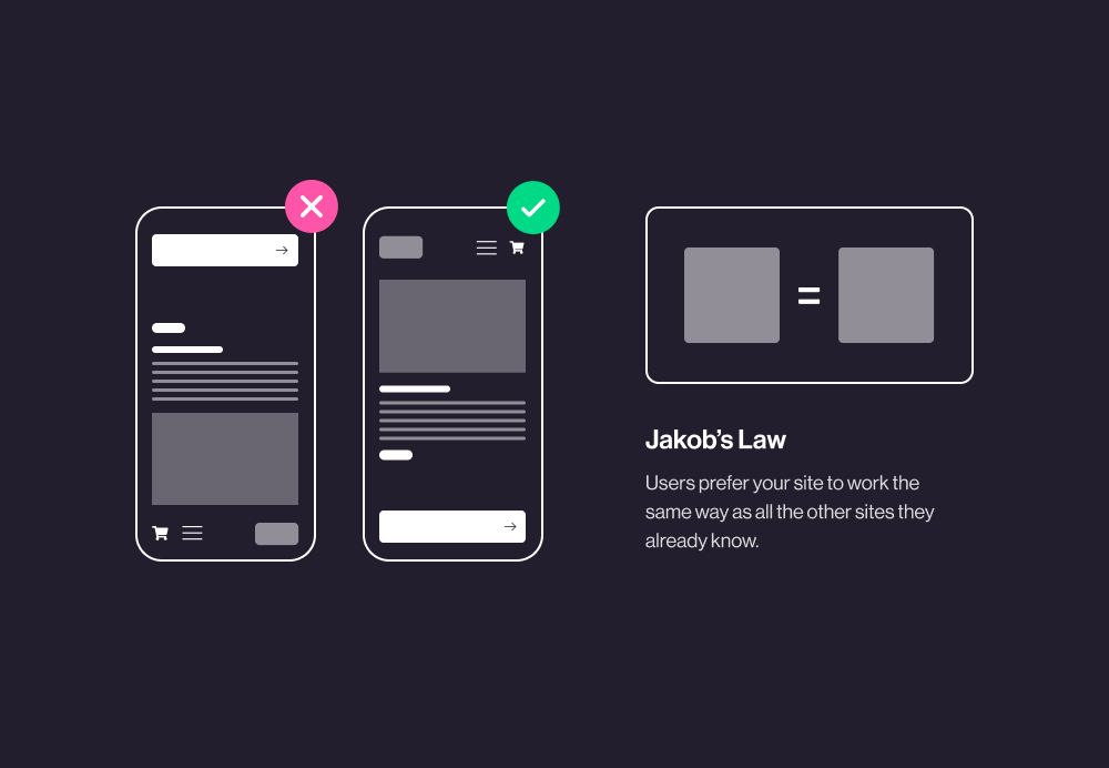
You’ve heard, “Don’t reinvent the wheel” right? Jakob’s Law uses this same principle. There are certain features or parts of a website that have to be just like most of the other sites out there; otherwise, it would be very difficult for a user to interact with.
This law applies to all web products. Your design needs to have a level of predictability to minimize the time a user spends trying to use your product.
Let’s say you hired us to design an ecommerce website, and you insist you want something that “disrupts” the checkout experience and make it something totally different than anything anyone’s seen before. We’ll definitely warn you that you may not sell many (or any) items with this strategy.
On an ecommerce website, users have certain expectations: the “shopping cart,” entering their billing and shipping information, and finalizing a transaction. If you radically change this process, or even just the look of it too much, you’re going to notice a high cart abandonment rate.
Just because you have to do things similar to others doesn’t mean you can’t be fresh or unique, however. Our design team has the experience to meet your needs for a brand identity while also ensuring that your customers can easily use your website.
3. Fitts’s Law
“The time to acquire a target is a function of the distance to and size of the target.”
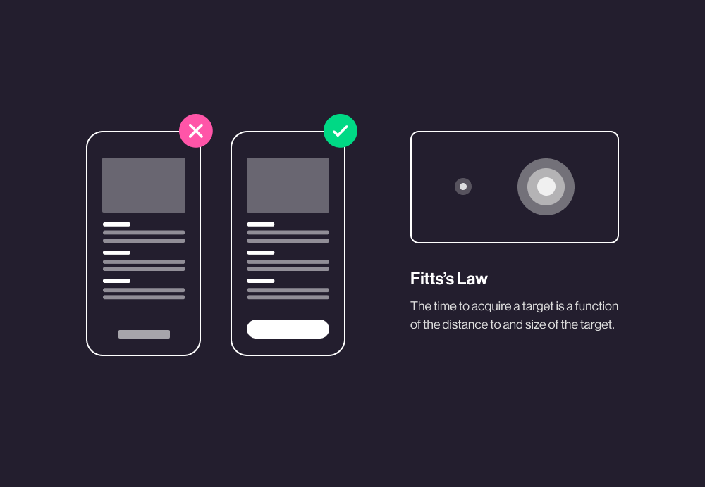
Paul Fitts, a psychologist at Ohio State University, examined the human motor system in 1954. He created a model that describes how quickly people can select a target, surmising that the time required to get to a target depends on the distance to it, yet relates inversely to its size.
To distill the important message here: With Fitts’s law, there is a speed-accuracy trade-off and rapid movements taken toward small targets result in greater error rates.
This law is huge when it comes to designing websites and apps, especially for mobile devices. On phones, touch targets need to be big enough to be pressed without difficulty. It’s also important to place regularly used functions near each other for ease of use.
Think about how annoyed you would be if the “Sign In” button you need to click after entering your email address and password to your email suddenly moved to the far left corner on your screen. To apply Fitts’s law in this example, you should place buttons to complete an action close to those elements.
It also tells us that important actions should be large and easy to select, and in general, any type of interactive element (i.e. a drop-down menu, a list, etc.) should be short.
I bet you’re probably thinking, “Duh!” right now, but you’d be surprised how often Fitts’s Law can be overlooked by an untrained UX/UI designer. Since you don’t get a second chance at a first impression, it’s important to weed out all violations of Fitts’s Law during usability testing.
If someone downloads your app and immediately has trouble making selections or easily pressing touch points, they are likely to just delete your app (or exit your website) and move onto the next best solution.
4. Hick’s Law
“The time it takes to make a decision increases with the number and complexity of choices.”
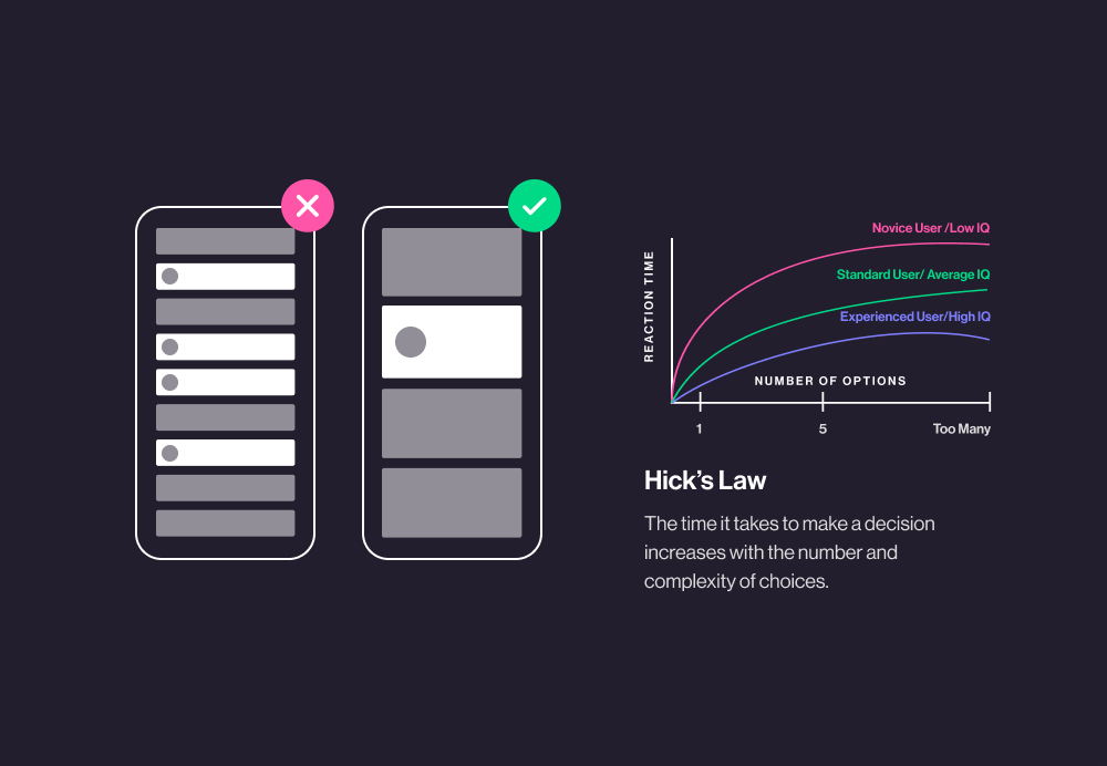
If you’re super indecisive like me, you know that adding more choices to a decision always makes it harder. It can lead to analysis paralysis and cause you to abandon the choice altogether. Humans say they like having a lot of choices, but when we get them, we tend to freak out and shut down (think about the last time you tried to choose where to eat dinner).
Hick’s Law is a fairly commonsense idea: the more choices you present to a person, the longer they take to make a decision. It’s essentially a fancier way to describe the KISS rule: Keep It Simple, Stupid!
Designers use Hick’s Law to balance out usability and functionality on your website or app to affect your users’ decision making process. We lay out web pages or app screens in a way that guide users to the quickest and easiest decision… like “Buy Tickets” or “Schedule A Consultation.”
Many clients want to cram a bunch of functionality in one place on their website, just for the sake of doing it. Or they want a Call To Action section that includes a form, a newsletter sign up, a phone number, a “Contact” button, and text. This is where we come in with our knowledge of Hick’s Law to say that the less stimuli around a decision, the better. Crazy graphics and animated elements are cool, but not when they get in the way of a user making the decision to choose your business over another.
There are a few exceptions to Hick’s Law, however. If your user has made a decision before seeing extra functionality or stimuli, then you don’t need to worry about it getting in their way. Also, when it comes to super complex decision making (i.e. there’s a lot of reading or research involved to make a decision, it becomes more difficult to apply Hick’s Law.
5. Miller’s Law
“The average person can only keep 7 (plus or minus 2) items in their working memory.”
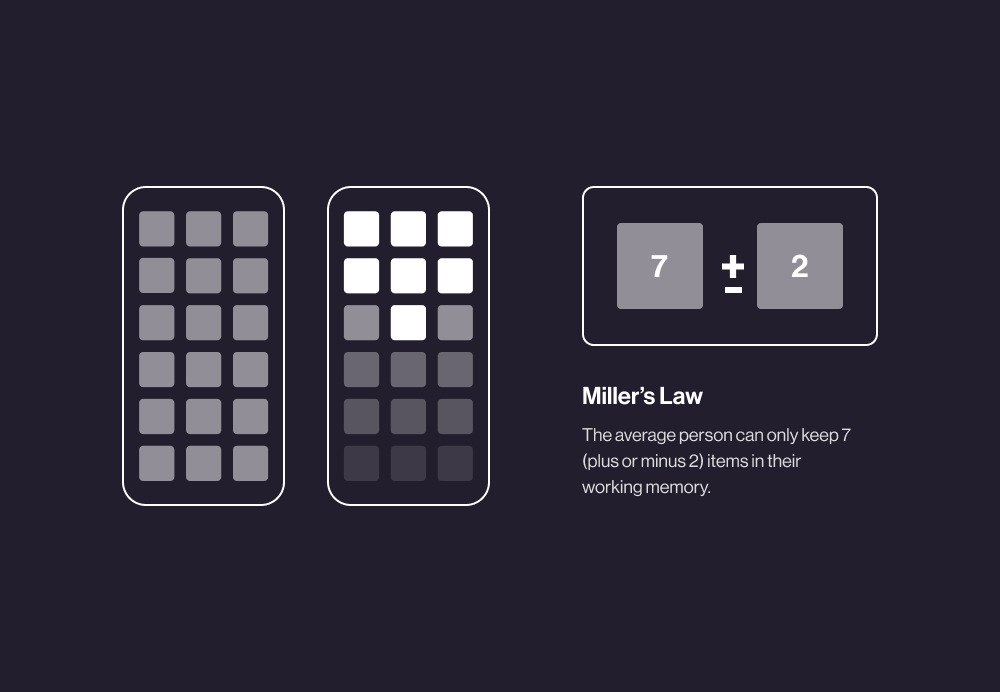
Unless your last name is Cheech, Chong, or Fichman, researchers like Harvard University’s George Miller say you can hold onto 7, plus or minus 2, items in your working memory.
Let me give you a number… 8162987018. Read it from left to right, close your eyes, and try to recite it back. You probably can’t, can you? Now let me put it this way:
816-298-7018
It’s easier, right? You might not have memorized Lifted Logic’s phone number yet, but it certainly is easier on your brain when laid out this way.
You’ve been using Miller’s Law most of your life, you just didn’t realize it! Whether it’s phone numbers, bank card numbers, or even the dashboard of apps we use every day, Miller’s Law helps your brain process the complex world around it.
A less pretty word for applying this law is chunking. If you’re going to present a lot of items to a person, you need to make sure it’s only as much as they can reasonably keep in their short-term memory or that the items are easily chunked, or grouped.
Our brains naturally want to cluster and chunk complex information or concepts for increased comprehension and improved long-term memory of the items, and your design should lean into that.
Don’t give your users too many options, group information in chunks, and to be safe, don’t rely on the short term memory of your users!
6. Tesler’s Law or The Law of Conservation of Complexity
“Every application must have an inherent amount of irreducible complexity.”
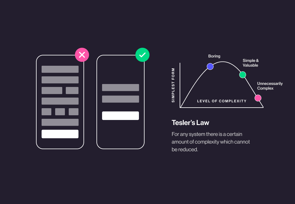
The previous 5 UX laws I’ve discussed are heuristic, or “hands on” methods of learning—they are mostly common sense. Tesler’s Law, AKA the law of conservation of complexity is a design principle instead, and it’s a little more difficult to grasp.
In high school, we all learned about the law of conservation of energy that says the total energy of an isolated system remains constant, it cannot be created nor destroyed. Instead, energy transforms from one form to another.
With this law in mind, Larry Tesler, who worked at Apple on the MacApp object-oriented framework, realized that how a user interacts with an application is just as important as the application itself.
Since you can neither remove nor hide all complexity in any given application, you should put the burden of distilling the complexity on the application’s design and development team rather than the user. For example, if a web developer can add more complex code that makes interactions simpler with users, he or she should do it, even if it takes a significant amount of time to accomplish.
7. Doherty Threshold
“Productivity soars when a computer and its users interact at a pace that ensures neither has to wait on the other.”
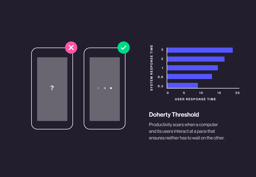
Back in the ‘70s, IBM’s standard for computer response time was 2 seconds, or 2,000 milliseconds because it was thought that humans took a full 2 seconds to plan their next task. Then Walter Doherty came along. His published research with Ahrvind J. Thadani in the IBM Systems Journal indicated that the computer response time that keeps humans happiest is actually 0.4 seconds, or 400 milliseconds.
It turns out that computer processing times have an effect on a user’s decision making process. Unlike what was previously thought, if the computer’s response takes longer than 400 milliseconds, the user can lose their train of thought and get off-task.
To sum up this UX law, the closer you get your website or app’s response times to 400 milliseconds, the more successful user interactions you will see. If a 400 millisecond response time simply can’t be met, it’s important to inform the user that they will experience a wait time by visually displaying a loading screen with a simple message to let the user know something is still happening.
8. Pareto’s Principle or the 80/20 Rule
“For many events, roughly 80% of the effects come from 20% of the causes.”
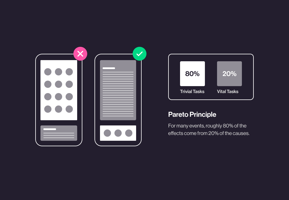
Also known as the 80/20 rule, Pareto’s Principle was set forth by an Italian economist who observed that 80% of Italy’s land was owned by 20% of the population in 1906. Yes, I know this is a little unclear in how it relates to design, but the 80/20 rule applies in a vast range of situations.
In business, people often say that 80% of their revenue comes from 20% of customers. In sale,s they say that 20% of the sales staff drive 80% of the sales. Don’t get too bogged down in the exact numbers, though. 80/20 is simply a good guideline!
To apply this rule to UX design, we simply interpret it as, “Focus your efforts on the variables that bring in the most benefits for the most users.” Let’s take Microsoft, for example. In 2002, Microsoft learned that 80% of the errors and crashes in Windows and Office are caused by 20% of the entire pool of bugs detected, and that over 50% of the headaches derive from a mere 1% of all flawed code. In light of this, Microsoft decided to prioritize faster bug-fixing to improve its security and reputation. They installed user error reporting in Windows and Office in 2003. Once customers could easily report errors to the system, 20% of all bugs in Windows XP were stomped on, with significantly less bugs in the following versions of Windows XP.
You are only one person with a finite amount of time/budget from a client. Applying Pareto’s Principle helps you prioritize the simple changes you can implement quickly to solve the biggest majority of issues.
9. Law of Similarity
“The human eye tends to perceive similar elements in a design as a complete picture, shape, or group, even if those elements are separated.”
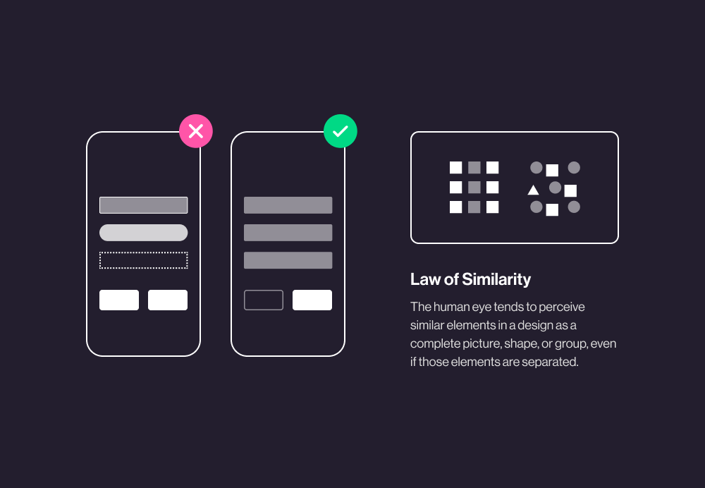
Just like we talked about with Miller’s Law, your mind likes to group or chunk things together to better understand and digest information. Our eye uses cues like similarity, continuity, closure, connectedness, and proximity (more on this below) to better understand and interpret information.
Knowing this natural inclination, we use the law of similarity in UX design to consider the size, color, shape, orientation, and/or movement of elements to signal which share commonalities. All these ideas come together to form the Gestalt laws of grouping.
Understanding the Gestalt law of similarity is huge for laying out information or products, especially in an ecommerce shop. Creating visual prominence for sales or new arrivals, using different fonts to organize ideas, or even something as simple as making a clickable link appear visually different from regular text puts the law of similarity to action, helping your users navigate and use your website or app more efficiently.
10. Law of Proximity
“Objects that are near, or proximate to each other, tend to be grouped together.”
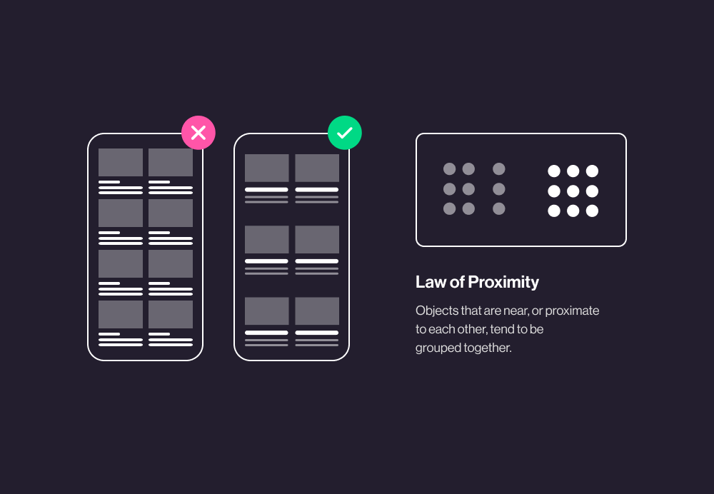
Another Gestalt law of grouping UX design principle is the law of proximity. This one is fairly straightforward—users tend to assume close objects share commonalities.
The law of proximity helps designers organize information in a way that’s most easily understood by users. Using clear structure and visual hierarchy helps users’ minds easily recognize and react to information, setting you up for more successful user interactions.
11. Serial Position Effect
“Users have a propensity to best remember the first and last items in a series.”
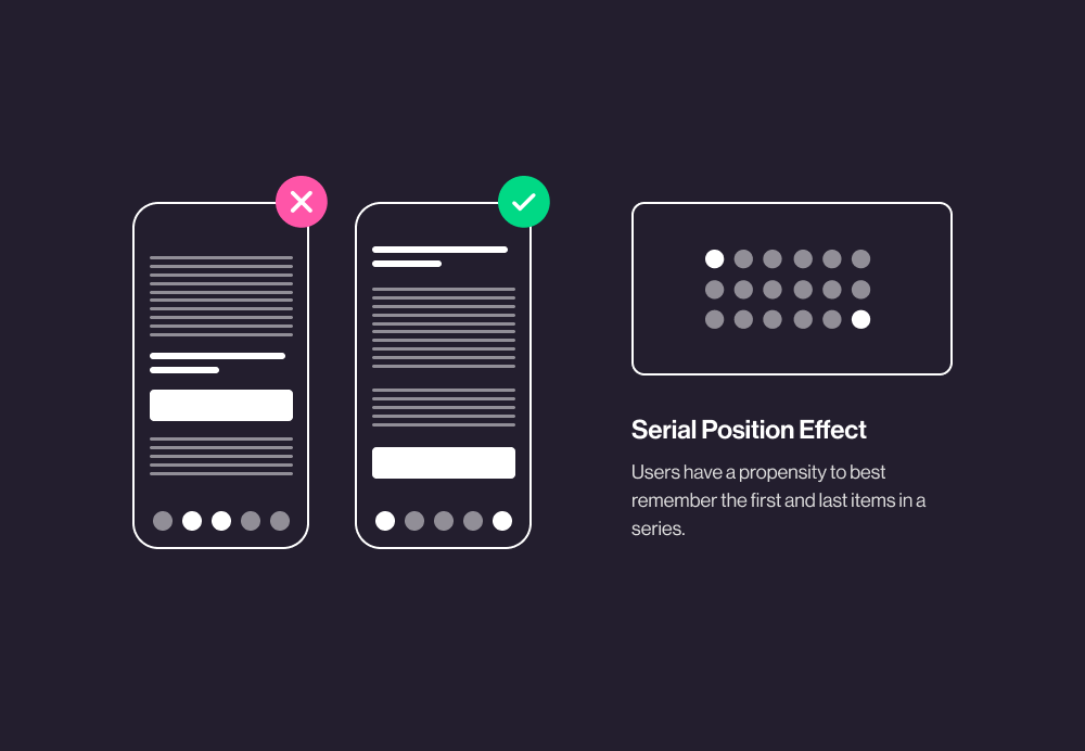
If you had a Nintendo 64, you might remember that Mario Party mini game where you have to remember the sequence in which koopas, toads, goombas, and the like run across the screen. I bet it was easiest to remember the first character, the last character, and then everything in between was somewhat hazy, right?
That’s the Serial Position Effect in action. How can UX designers use it?
- Placing less important items in the middle of lists
- Placing the most important items first and last in a list
- Positioning key actions on the far left or right side of the element
Similar to Miller’s Law, understanding the limitations of human short-term memory is super important for creating good UX design. The less strain you put on the user, the easier it is to guide their decisions.
Questions about UX/UI for web design? Hit us up!

Hannah McGean, Lead Designer
When in doubt, trust Hannah's taste. She's created cutting-edge websites, pushed the UX/UI envelope, and masterminded high-functioning design. As Lifted Logic's Lead Designer, Hannah now manages LL's design department and serves as the final arbiter of all asset development.