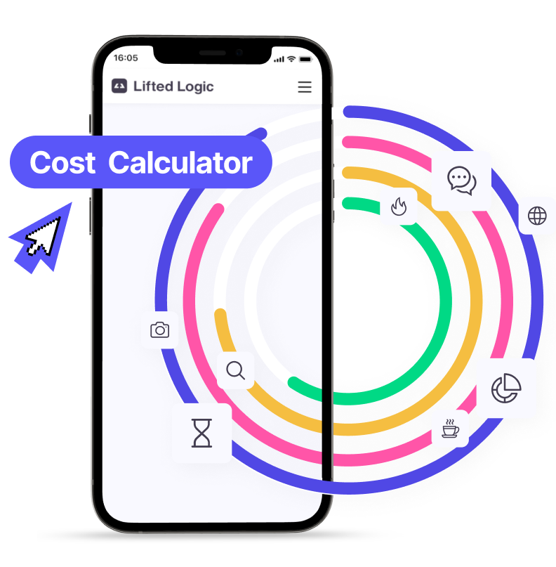
Find out how much it will cost to grow your business!
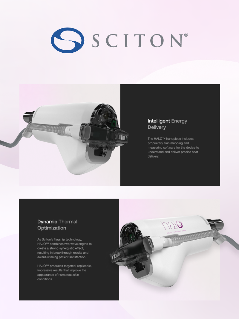
Sciton
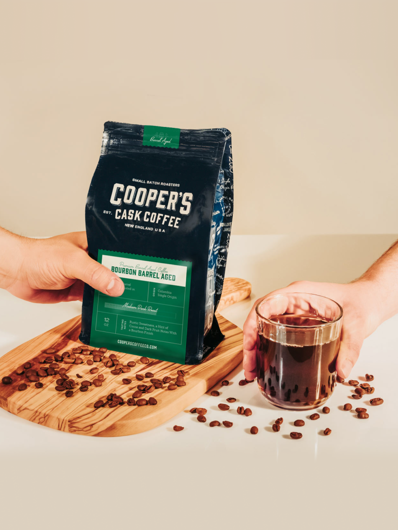
Cooper’s Cask Coffee
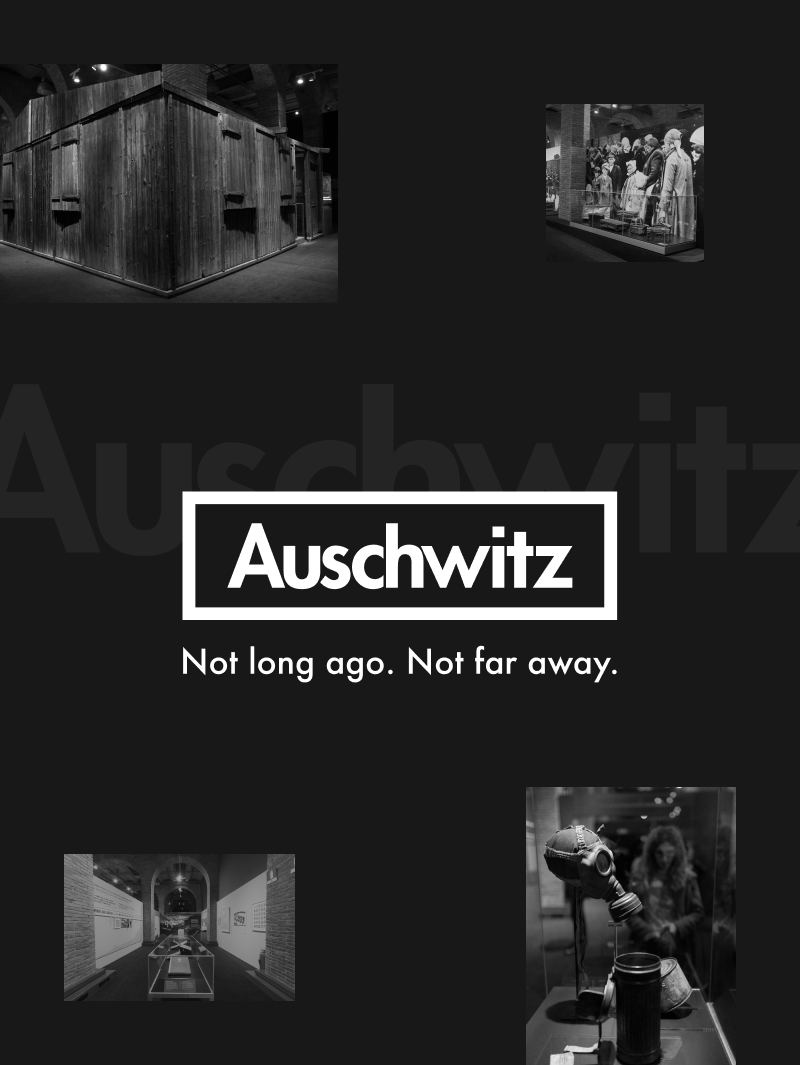
Auschwitz Digital Exhibition
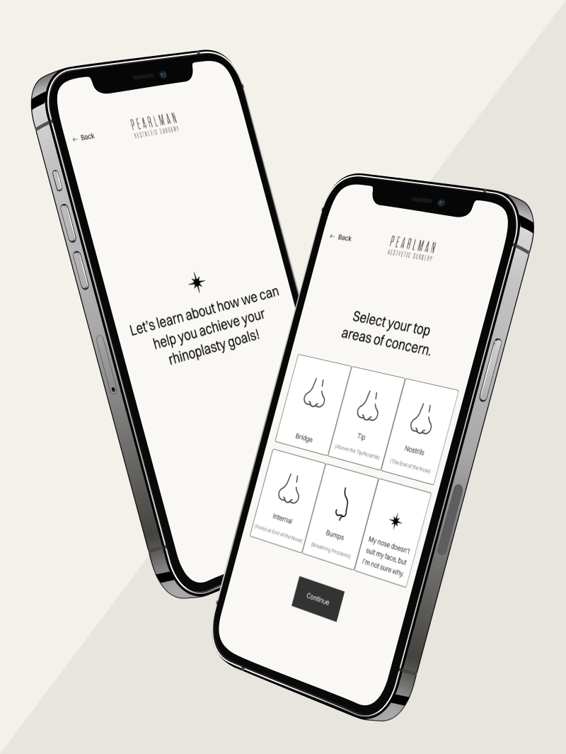
Pearlman Aesthetic Surgery
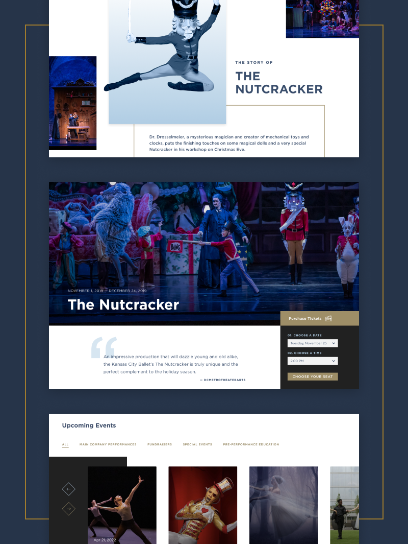
Kansas City Ballet
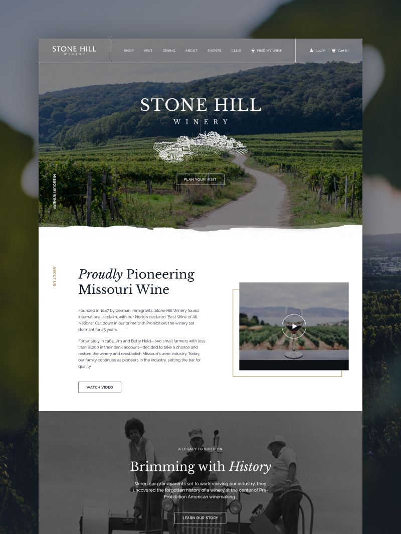
Stone Hill Winery
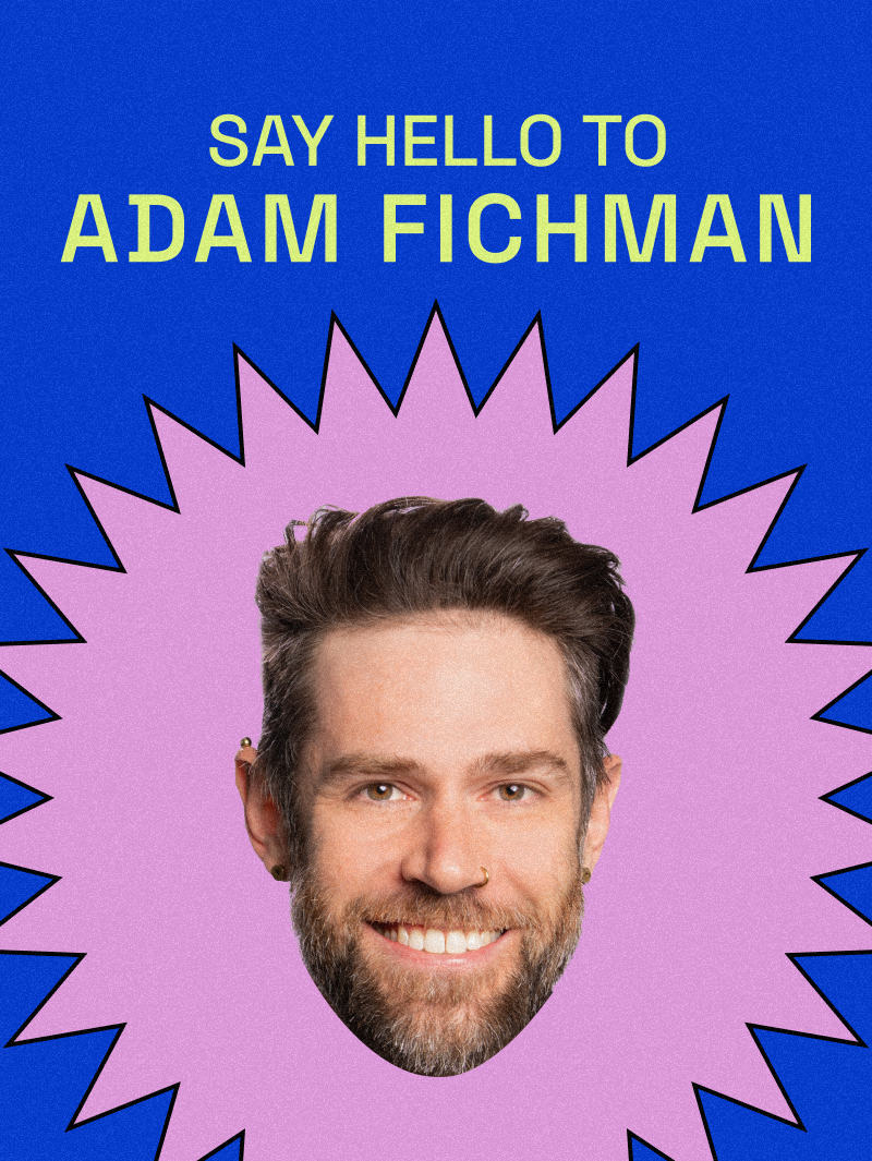
Adam Fichman
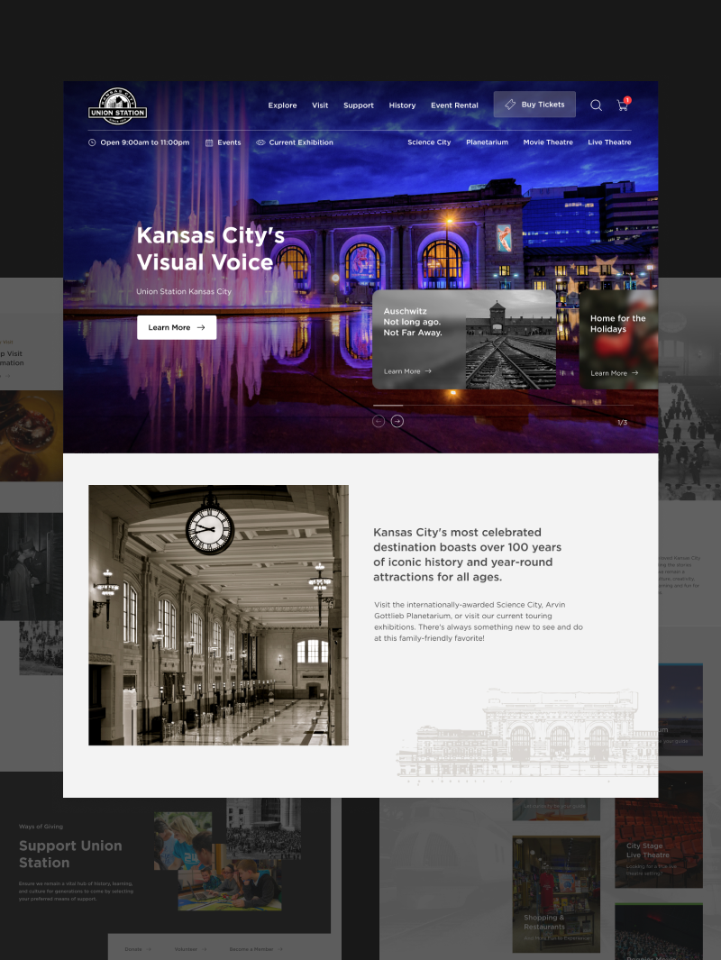
Union Station
Don’t leave money on the table.
Find out how much it really costs for a site with killer ROI.
Cost Calculator