
E-Commerce Website Builders
You only have 2 to 3 pages to turn a user into a paying customer. The biggest issues with e-commerce sites are poor organization, product photo quality, and excessive checkout requirements.
With millions of annual product sales under our belt, Lifted Logic is Kansas City’s premier e-commerce website design & development company, making it easy for your users to order your products and watch your bottom line skyrocket.


Gain access to all the benefits and tools you need to grow your website and enjoy digital success for years to come.
We think about what step-by-step process makes the most sense toward building and buying one of your customizable products. we test this process extensively to ensure that any user in your target audience can successfully complete an order. This is essential to ensuring that you don’t see cart abandonment or other website dropoffs because your ordering process is too complicated or confusing.
All websites built by Lifted Logic are easy to use and motivate visitors to purchase sooner.


Get Started Today
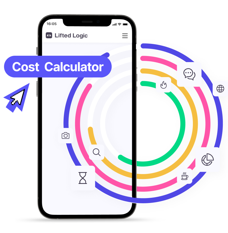
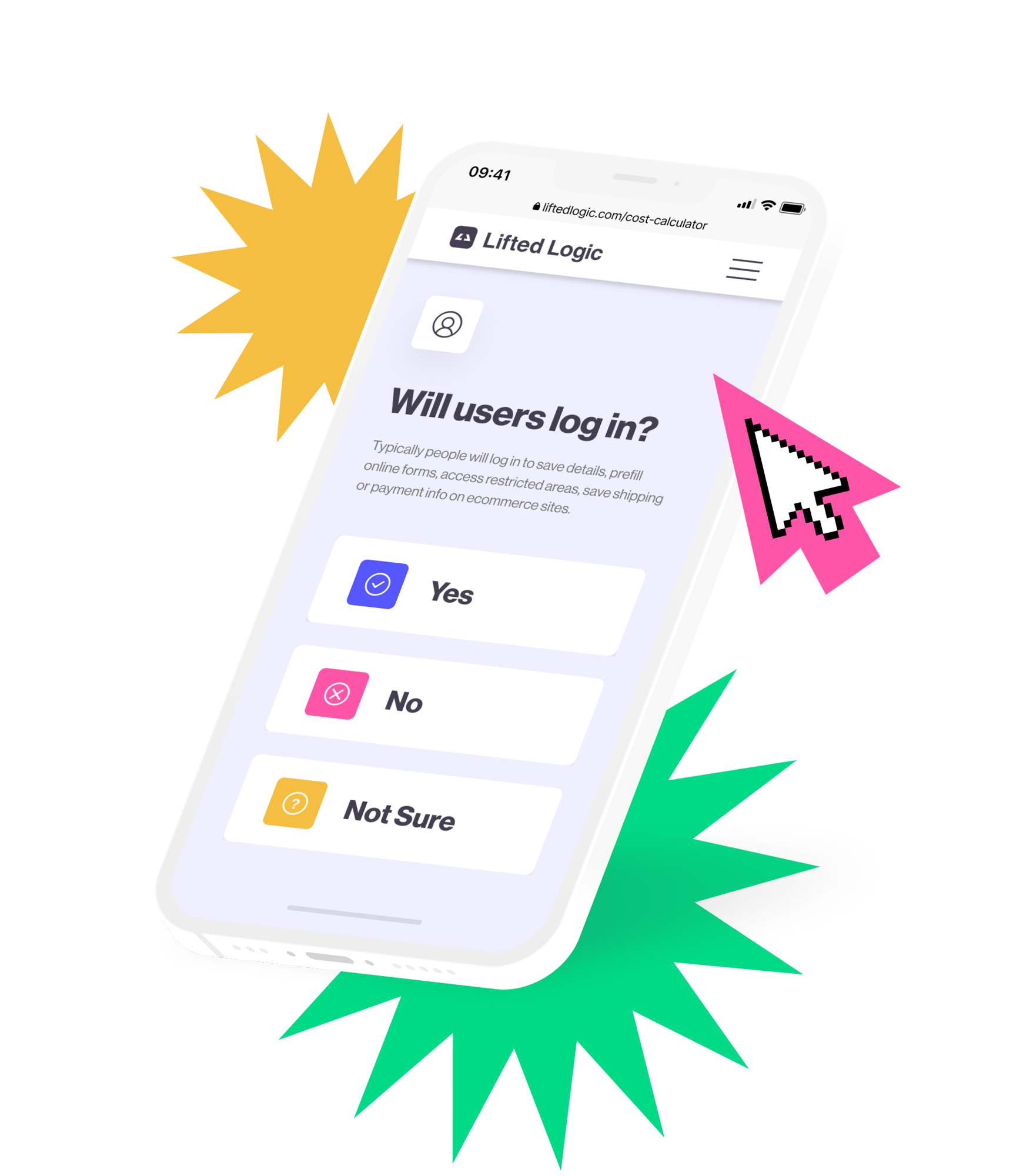
Use our Cost Calculator
Get started with a new custom website, then never look back.
While designing and developing a design for an e-commerce store, our goal is search engine optimization (SEO) AND conversion optimization (CRO). We not only want to help you show up for relevant searches more often, but also help you convert those results into new customers.
We have over 10 years of experience building successful, operational e-commerce websites for clients across the country. We are owned and operated by Adam Fichman, who is a business owner first. He and our team can help advise you on best practices to keep your operation efficient and effective, including additional services like:
Each e-commerce platform has its advantages and disadvantages, but we can help determine the best solution for your company. Whether you’re starting from scratch or adding an e-commerce solution to an existing website, we have an e-commerce platform solution for you.
“Lifted Logic has been a pleasure to work with. Adam, Todd, Becca, Emma, and the rest of the team take the time to gain understanding of your project, needs, and budget. I never felt pressured or like I was getting a sales pitch. They are genuine people that are highly intelligent and solved our problems collectively with us.
We trusted Lifted Logic with a large e-commerce web build for over 700 products and also services. They worked hard for us and taught us a lot in the process. We were offered free meetings around SEO, content strategy, analytics, and more. Can’t recommend these folks enough.”
— Chris Correll
Marketing Manager at Glendo LLC dba GRS

Our Kansas City agency loves working with both start-up and established e-commerce businesses. We hope yours will be next 😉
Recent Posts
Design
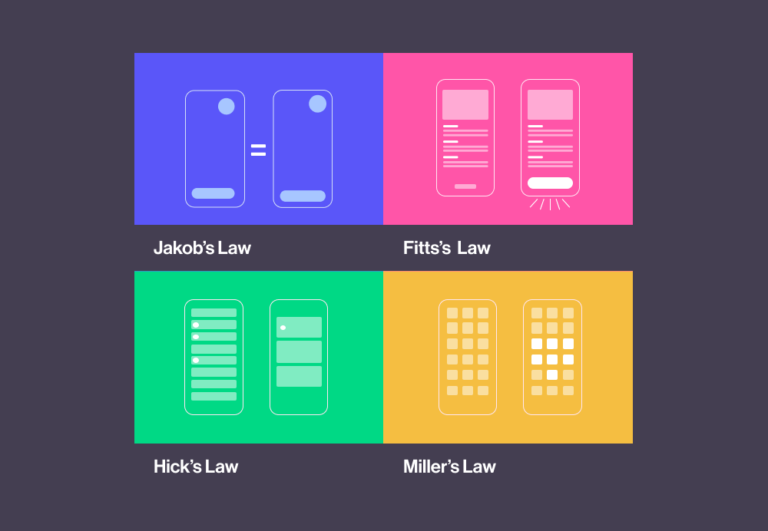
11 Essential UX Laws for Your Next Web Design or App Project

Hannah McGean, Lead Designer • 20 Jul 2021
Business Development
14 E-Commerce Questions Your Web Design Company Should Ask You About Your New Online Store
Lifted Logic • 13 May 2019
Automatic Shipping Calculation for E-Commerce Websites
Lifted Logic • 03 Jul 2014
Does your company have a storefront but wants to expand online? Or maybe you started online but are now opening a storefront?
It can be both challenging and time consuming to deal with two different systems that don’t speak to each other. Our team regularly assists clients with creating the code to link their POS with their e-commerce system so information is seamlessly transferred.
Many companies have internal systems that need to be integrated into an e-commerce build. Kansas City’s e-commerce website design & development company can help build API’s that speak to these systems and relay information back and forth after every order is submitted.
Your Options
Depending on the volume of sales processed through your e-commerce platform, it may be helpful to automatically calculate taxes and/or shipping amounts based on the shipping address. Your e-commerce platform can calculate sales tax as well as determine accurate shipping costs.
When you commissioned Lifted Logic to create your custom ecommerce website, you knew that you wanted to focus on doing what you do best: providing excellent products and services for your customers rather than having to perform all the menial tasks associated with running an online store. With Lifted Logic’s custom ecommerce websites, we include automatic shipping and tax calculation to let your website do the hard work for you.
Automatic Shipping Calculation
No matter which mail service you choose to deliver your products with, be it UPS, USPS, or FedEx, Lifted Logic can integrate that particular service’s API into your website to automatically calculate shipping costs, based on the customer’s shipping destination. We input each of your products’ weight and dimensions, along with the size and weight of the box it’ll be shipped in to accurately calculate shipping costs to ensure that you don’t lose any money during a transaction. Additionally, we provide users with options for shipping (i.e. standard or expedited) while applying the appropriate additional charge, if applicable.
Automatic Tax Calculation
In order to ensure that your business is complying with all tax laws, Lifted Logic’s developers can also integrate automatic tax calculation for your products. Using a unique software called TaxCloud, your ecommerce website will be able to do the following, and more, for you:
Different industries have many different types of products. Some products have different variations such as size or color; some have required parts that must be ordered together; some companies want customers to view products that visually change when options are selected; some have the need to add notes. Our e-commerce website design & development company can build all of this and more.
One of the most important things when building an e-commerce system is to make sure that Payment Card Industry Compliance is in place. Credit card information can never be stored within the website. For recurring subscription payments, the credit card data must always be stored by the credit card gateway.
If your business is interested in opening an online store to sell your products or services, there are quite a few questions your web design company should ask you before your project begins.
Lifted Logic asks these e-commerce questions to help inform our recommendations on building your site’s structure and functionality.
Generally, you should be planning your e-commerce functionality in order to be effective in the present. However, you should use this time as an opportunity to define your overall business goals for the next two to three years if you haven’t already. This is also the average lifespan of a website.
Think about these questions carefully; your answers can and will change how your e-commerce website is designed and built. They will also dictate your customer’s experience with browsing, purchasing, and returns online.
Every business measures success differently. It could be measured in service calls, online sales, in-store sales, new product awareness, publisher visibility, and so many other ways. Without proper measurement of those successes, a business can only run in circles trying to guess what isn’t working, what is working, and how it did, or didn’t, work.
The most important aspect of any marketing investment is to have a plan of measurement. How are these products or services influencing the success of our business goals? How are they converting into paying clients or investors? How do we continue the engagement and increase the interactions? You must develop a plan on how to convert each marketing investment, and it has to be measurable.
This, by far, is the most challenging aspect of marketing that every business faces. It requires alignment of the business’ goals to the marketing strategy. Lifted Logic’s marketing team can help you develop a measurable goal, and determine how an ecommerce website is working, or not working enough, toward accomplishing that goal.
An ecommerce website and a physical retail location are, in essence, the same thing. You cannot operate a retail store without knowing who is walking in, what they are looking at, and why they make a purchase, or choose not to make a purchase. At Lifted Logic, we have a certified ecommerce Google Analytics consultant who can help you get to the heart of why your ecommerce website is, or isn’t performing.
Ask the Right Questions
Every business should be asking themselves questions about their website and asking them often. How is the site performing? Is it making us money? Enough money? Is it engaging our target audience and market? How are people finding our website? What are they doing when they get there? Do they like what they see? Are they filling their cart and then checking out? Most of the time, business owners answer these questions based on assumptions and perceptions. However, in the ecommerce business, it is not enough to blindly throw darts at a board and hope they hit the bullseye.
Understanding Your Users
So, how does one become able to answer the above questions, you ask? Just like physical retail locations have measures in place to determine the success of their store, ecommerce websites do too, through incorporating free Google Analytics. By measuring how you get your visitors, what they are doing on the site, how they are behaving, what they interact with, what they buy, if they call, if they email or fill out a form, and so much more, you can drive the most conversions possible through your website.
Whether you choose Lifted Logic for your new e-commerce site or another web designer, be sure your web design professionals are asking you these crucial questions. This information will allow them to understand your needs and build you a truly lean and custom site to match.
What will you be selling?
Products, services, or both?
How many products will you need to sell online?
The number of products may dictate the design and layout of the site’s store. Displaying eight products can (and should!) look much different than fifty or several hundred.
How many product categories will you need displayed to a user?
Do you sell five different types of pens? Or pens and pencils? Knowing how these products will be organized is another key piece of information needed to build your e-commerce shop. The content strategists & designers of the Lifted Logic team can certainly help you if you’re unsure.
Do you have consistent product photos?
Are these photos on a white background? If so, are they photos you shot, edited, and removed the background, or are they photos from a manufacturer? In the case of the latter, you’ll need a link (and permission to use!) to the manufacturer photos so your web team can ensure the quality will be good enough to use online. Nothing is worse than pixelated images or photos that don’t have a clean, cut out background!
Need top-quality product imagery? Our Photo & Video team are experts at product photography!
How frequently will your stock change?
One or two product changes are always inevitable, but if you plan on introducing an entire inventory shift at some point, your web design company will want to understand what that will look like, when the change(s) will be made, and how often these types of changes will be made. This will allow your team to make the proper preparations and be able to train your team on how to implement it in the future.
Do you already have a credit card processor?
If so, you’ll need to know which company that is, as well as your login credentials, to determine whether or not it can be linked up to the website. If you’re in need of a credit card processing service, we can walk you through the variety of options available to you based on your budget and financial needs.
Are you planning on charging sales tax?
If you’re planning to charge sales tax, will you be charging your state’s sales tax, or the shipping destination’s sales tax? (Typically local is fine, but we always recommend checking with your tax accountant or attorney to be sure.)
How would you like to charge for shipping your products?
Would you like to offer flat rate shipping or calculate shipping costs based on package size, weight, and where the customer lives? Are you planning on shipping via USPS, UPS, or FedEx? If you’re leaning toward flat rate shipping, then be thinking of what that amount would be in order for you to be profitable. You’ll also want to keep in mind whether you would like to offer free shipping with a minimum order amount, and if so, what amount the customer needs to add to their cart in order to unlock that deal.
In general, it’s essential your web company understand how shipping will be calculated. Does it need to be automated through an API? Will the amount be different depending on the level of shipping (such as ground air versus next-day)? These are all relevant and important e-commerce questions. In Kansas City, Lifted Logic can help you determine the best course of action for your online store regarding shipping calculations.
Will you need to pull in an API to sync with your POS?
An API (Application Program Interface) is essentially a string of code that acts as a key. If your business’s operating system has an API key, we can potentially help to integrate your system and your website so that the two programs speak to one another. This can be especially helpful for e-commerce websites for inventory and customer tracking purposes. If you would like to integrate an API into your new website, you will need to provide your web team with API documentation to review from your POS system to determine integration requirements and specifications.
Will you need the ability to offer discount codes or coupons?
If so, do you want your users to be able to log in and automatically receive a percentage off of all (or certain) products, or will you require that they enter a promotional code before checkout?
Do you want the ability to sell or enroll users in any kind of online membership?
Offering tiered account levels for your users is much more complicated than only offering a “check out as guest” option. In this case, the site must be built to accommodate user accounts with the ability to track order history.
Do you have the capacity for a staff member to fulfill, box, and (if needed) take orders to the shipping service office?
We almost always bring up this particular e-commerce question in Kansas City because clients sometimes haven’t considered the day-to-day logistics of selling products online—e-commerce is still just an idea. However, if your site could be built to handle thousands of orders a day, but you can’t fulfill them, will that impact your customer service?
In this regard, every company is different. Some handle shipping internally, while others’ products are shipped through a third party product provider, and still others have warehouses. Depending on your business or supply chain, you will want to think about all of the intricacies that will go into handling your products.
How will you process refunds and handle return shipping?
Will you accept returns for only a certain amount of time? How will you refund the money? Who pays for shipping returns?
(While this typically isn’t a part of the process your web team should have much involvement in, we think it’s important to ask all the questions you may not have thought of yet.) Additionally, our content team may want to know when and how to display your return policy on your website.
Where will you host your site?
Ensure your server will have the capacity to handle spikes in traffic or orders (typically around the holidays, sales, or order deadlines) as quickly as it can for a single shopper. This will ensure the site is responsive and does not cause any delay in the online checkout process. In addition to web design and development, Lifted Logic offers hosting services starting at $150/month.