Websites Made with ♥ in Kansas City
The “best” web design agency in Kansas City? Yeah, it’s kind of subjective. It’s just something we’ve been told over and over again—whether through our 150+ Google Reviews, dozens of long-term marketing clients, or 100s of awards we’ve won over the years. At the end of the day, we let our work speak for itself. If that makes us “the best,” then heck, we’ll take it.

Lifted Logic is a collection of experts in our respective industries.
Throwback
Our web design agency in Kansas City has its origins in 1Dawg, a company built and ran by college students. It was the first business to send a video from the internet to a cell phone.
While shopping for investors and licensing 1Dawg’s software, Lifted Logic’s founder, Adam Fichman, realized the pitfalls of a detached and cold corporate culture. He set out to build a company where the employees know their value and love coming to work—and where all the clients find sustainable, long-term success. That’s Lifted Logic.

Fast Forward to Today
We’re business owners first, but we’re also marketing professionals, social media gurus, code wizards, and a whole collection of other talented team members. That’s something you won’t find anywhere else.

What We Do
The Method to Our Madness
There are always a lot of rumors going around about SEO and web design. We promise to always seek truth, and share that truth with you, even if that means we aren’t the right fit for your project.
Every day, we guide our web design agency by the mantra “do what you know is right.” If that means we have to work hard every day, so be it—it gives us an excuse to play hard too.
Between client happy hours and other community events happening throughout the year, you’ll have the opportunity to be introduced to tons of other business owners and marketing professionals in Kansas City and beyond.
We don’t just send you on your way once you’ve paid your last invoice. As a Lifted Logic client, you’ll get free training for the entirety of the long and beautiful life of your new website.
Who We Serve
A Crossroads gallery and a Northland contractor need different websites. The gallery might promote exhibits and update event details. The contractor needs homeowners to understand its services and request an estimate.
Then there’s the state line. A company working in Overland Park, Kansas City, and Lee’s Summit should explain where it serves customers. Customers should know whether their address qualifies.
As a web design agency in Kansas City, Lifted Logic considers the people behind each visit. We consider the business’s service area and buying process to plan content, navigation, and calls to action. The result should make sense to the people you’re trying to reach, whether they’re down the street or across the country.





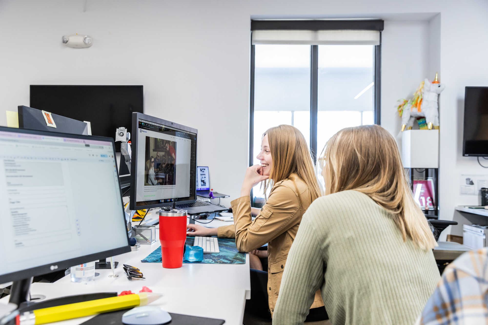
At our web design agency in Kansas City, we take solving our clients’ problems to heart. We stay curious about your business, customers, and design challenges to create a sustainable product you’ll actually use. When you’ve worked hard to earn the trust of your customers, you need a functional and appealing product driven by measurable data.
Our WorkWith 100 employees, our web design agency in Kansas City gives away over $1 million worth of goods & services every year to deserving small businesses, non-profit organizations, and other pillars of the Kansas City community. We even let KC decide the recipient of a $50,000 grant every summer.
We <3 KCFrom the Blog
What do I do with a history major?
Charlie Huette, Creative Director • 13 Mar 2023
The Three Types of Workplace Feedback
Charlie Huette, Creative Director • 03 Feb 2023
English majors, your dream job awaits.
Charlie Huette, Creative Director • 20 Jan 2023
A wireframe is an early website layout that shows how sections of information and features might fit visually on a page. It helps everyone review the structure before things like content and branding take over the conversation.
While your site represents your business identity, it should have a solid foundation of usable sections.
A wireframe can also show where a project gallery or contact form belongs. For a Kansas City home service business, that could mean keeping service details near an estimate request. Someone with a leaking pipe probably has limited patience for hunting through 5 menu options.
When we talk through wireframes at our web design agency in Kansas City, we want useful and specific feedback that enables us to create the best site experience for your team and your customers. “Customers need to see our service area sooner” gives a designer something to work with. “It needs more pizzazz” can wait until the next conversation.
A mockup shows how a proposed page looks. A prototype demonstrates how parts behave when someone interacts with them. Both these stages give you opportunities for input as the team decides what to build.
A mockup may show typography and photography. You can also review spacing and button styles. A prototype might show how customers will open a navigation menu or move through a sample booking process.
Before approving a design, ask which elements are examples and which are ready to build. That keeps anyone from assuming every button already has a working website behind it. We wish pixels were that ambitious.
You should also define what you should review at each stage. A polished image doesn’t prove that a form sends an email or that a search tool works. Those features need development and testing.
Start by identifying the people using the website and the decisions each person needs to make. Different audiences may need separate paths through the same set of pages.
Consider a manufacturing company. Purchasing managers want specifications and lead times. Job applicants need openings and workplace information. Past customers might prefer support documents. Putting every option into 1 giant menu usually makes everyone’s job harder.
We can group related content, create clear entry points, and choose labels visitors recognize. A homepage should point people toward their next step without requiring an internal department chart.
One practical test: Ask someone outside your company to find a specific answer without help and watch which label they choose first. If they keep guessing, your navigation probably doesn’t reflect the way real customers search.
As a web design agency in Kansas City, we also account for the differences between local buyers and national accounts. Those visitors often arrive with different questions, so the design should highlight key answers for each customer group without making them dig for the information.
Custom layouts make sense when a page needs to present information or support an action in a unique way. Reusable templates keep similar pages consistent and easier to maintain.
A standard service page may suit businesses that want a similar layout for each offering. A detailed equipment catalog might need comparison tables or downloadable specifications for customers to evaluate differences between choices.
We look for patterns before creating new designs. Pages with the same purpose usually need the same structure. That gives your team a simpler editing experience later and allows users to quickly identify how to navigate your site.
As with everything else we do at Lifted Logic, keep in mind that “repeatable layout” does not mean “boring site.” We still bring creativity, intentional detail, and all kinds of flair to building your pages. You can give customers options to easily compare or explore options while still enjoying a site that demonstrates your unique character as an organization.
The top of a homepage should quickly explain what the business does and guide visitors toward useful information. The first screen to load has limited room, especially on a phone.
We prioritize a clear headline and obvious supporting image. The page also needs an obvious way to explore services or contact the business. The element that deserves the most attention depends on common visitor goals.
Picture a Crossroads gallery promoting an upcoming exhibition. Dates and ticket information deserve early placement. A commercial contractor may need to show the types of projects it accepts before asking for an inquiry.
We use business-specific goals to decide what earns space near the top. At our web design agency in Kansas City, our team starts by considering what visitors need to understand. A giant video of your lobby might look fantastic, but the headline still has to do its job.
A service website should help visitors complete every important task with a smaller screen and fewer taps. That often means simple navigation and easy access to contact details.
Let’s say a homeowner in the Northland wants to find an electrician. They may need to confirm the service area and request help. Those steps should stay easy to find, not buried under a scrolling parade of giant decorative images.
Buttons need to be large enough for easy clicking. Forms should use readable labels and fields that work with a phone keyboard.
Our web design agency in Kansas City considers key interactions during design. We also check pages on real screen sizes. A beautiful desktop layout squeezed onto a phone can develop odd proportions or cover up necessary information or action steps.
Place calls to action where visitors have enough information to make the next decision. Their wording should also tell people what to expect when they click.
A service overview button may lead to a detailed page. A procedure page may offer an appointment request after answering common questions. Some visitors arrive directly at a service or product page through search or AI. They shouldn’t need to return to the homepage to find a contact option.
“Request an Estimate” is useful when someone wants pricing. “Learn More” has its place, but it shouldn’t have to carry every button on the internet when more specific language offers clarity.
Our writers and strategists review each page’s purpose and choose the right actions for it.
A good contact form asks for the information your business needs to respond and explains what happens after submission. Visitors should also know which fields are required and how to fix errors.
For an initial inquiry, a name, contact method, and short message may be enough. Specialized project requests could call for more detail. We decide what to ask by looking at the first conversations your team has with new clients.
Field labels should remain visible while people type. Helpful error messages identify any field that needs attention. After submission, a clear confirmation tells visitors their request went through.
When your web design agency in Kansas City builds forms around these details, customers find them easier to use and staff can process inbound leads more effectively. Visible instructions and clear labels support accessibility. Nobody should have to guess whether a form worked.
Start a complex page with the key details buyers need to compare options or decide whether a product meets their requirements. Then, organize that information so they can scan information and pick out the most important elements without reading a novel.
A Kansas City-area equipment supplier may need specifications organized in tables. A professional services firm might explain the stages of an engagement.
Clear sections and comparison tools help structure the specifications. A buyer should also be able to reach the right contact when they have additional technical questions.
At our web design agency in Kansas City, we make room for the useful details that distinguish your business. Good design helps someone understand the complicated stuff while keeping the technical details accurate.
Yes, your site can utilize animation or video without slowing down. You might want to demonstrate a process or show how a product works. Effective placement should account for loading speed and visitors who prefer less movement.
Google’s Core Web Vitals include testing for loading performance and responsiveness. Those measurements help us investigate whether ambitious visual choices affect the visitor experience.
Every web design agency in Kansas City should also consider reduced-motion preferences. Yes, we enjoy a good visual flourish. But a customer trying to read a page shouldn’t have to chase the text around the screen.
Interactive features should remain usable for people who navigate with a keyboard or assistive technology. That includes menus, popups, and forms.
During testing, we check whether keyboard focus moves in a sensible order. When a popup opens, users should be able to reach the controls or close it easily. A form should identify errors clearly so someone can correct them.
We check small screens and increased text sizes, too. A menu that looks fine in a design file can become difficult to operate when text wraps or a button disappears behind another element.
Our web design agency in Kansas City checks these interactions as working features, so that we can align with Web Content Accessibility Guidelines (WCAG).
Useful design feedback identifies the specific concern and the change you’re hoping to make. It gives the designer enough context to suggest a solution.
Say your sales team thinks a product page needs more details. Tell us which questions buyers still ask. If a director wants a different homepage image, explain what the current one fails to communicate.
Collect feedback from internal reviewers before sending it to the design team. When 2 departments disagree, a single decision-maker should help resolve the priority. That avoids a page getting redesigned every time a new person opens the file.
Projects move faster when approvals have clear owners and specific changes. We can only do so much in response to yet another request to “make it pop.”
Before launch, test the tasks visitors rely on and check that finished pages match the approved designs. Ideally, testing should catch mistakes while the team can still easily fix them.
That means taking actions like:
As the client, you also need to confirm key contact details and service descriptions. Clarify with your web design agency in Kansas City to make sure you know where submissions or issues get directed. For a local event venue, a broken ticket link on launch day is a pretty memorable first impression. Let’s make the memory a better one.
(If you don’t, you should.)
We deliver the highest level of expertise as a marketing, SEO, and web design agency in Kansas City. Because—spoiler alert—”just Googling it” doesn’t work.