
It is estimated that mobile online traffic doubled in 2013 alone. This fact makes one thing clear to businesses: a solid mobile website strategy is absolutely essential from now into the foreseeable future. At Lifted Logic, we offer mobile responsive website optimization in Overland Park as a standard part of our custom website building services. A site optimized for mobile and tablet browsing, that responds to and adjusts to various screen sizes is absolutely essential to any business since the increased number of mobile users expect to experience the same user-friendliness and design as the full website. The website optimization experts at Search Engine Land posted an article with tips on how to establish a successful website in the ever-expanding mobile web:
Understanding Mobile Users vs. Desktop/Laptop Users

A mobile user is on-the-go. They are looking for the information they need quickly, and if they do not find it within the first few seconds on a website, they will move on to the next one in the search rankings. While desktop users have more time to browse at a leisurely pace, a mobile user is in a time crunch and needs fast, easy to access information. A mobile user is also operating with a much smaller screen, so text that works in a vertical mode that requires next to no zooming is ideal.
Mobile Expectations
People use different devices for different things. Content (and ads) should be tailored to fit each type of device according to the typical expectations that each type of user expects. Mobile users expect a clear layout and fast load times. Google emphasizes the importance of load speed when it comes to mobile optimization. A website with effective mobile optimization carries over the same basic design and layout of the full site, but understands that too many animations or features can bog down load speed and is unnecessary for the mobile user. Simplicity is the key factor in understanding the expectations of mobile users.
Eliminating Inconveniences

If a mobile website contains unnecessary logins, pop-ups, large images, branding, or is overly complicated, users will leave immediately and find the information they are seeking elsewhere. Eliminating these hurdles for users is crucial for a successful mobile web experience. The focus of a mobile website is user experience, not branding or advertising. Eliminating these inconveniences for users will also result in faster load times and noticeably longer stays on a website.
Lifted Logic’s Mobile Responsive Website Optimization in Overland Park
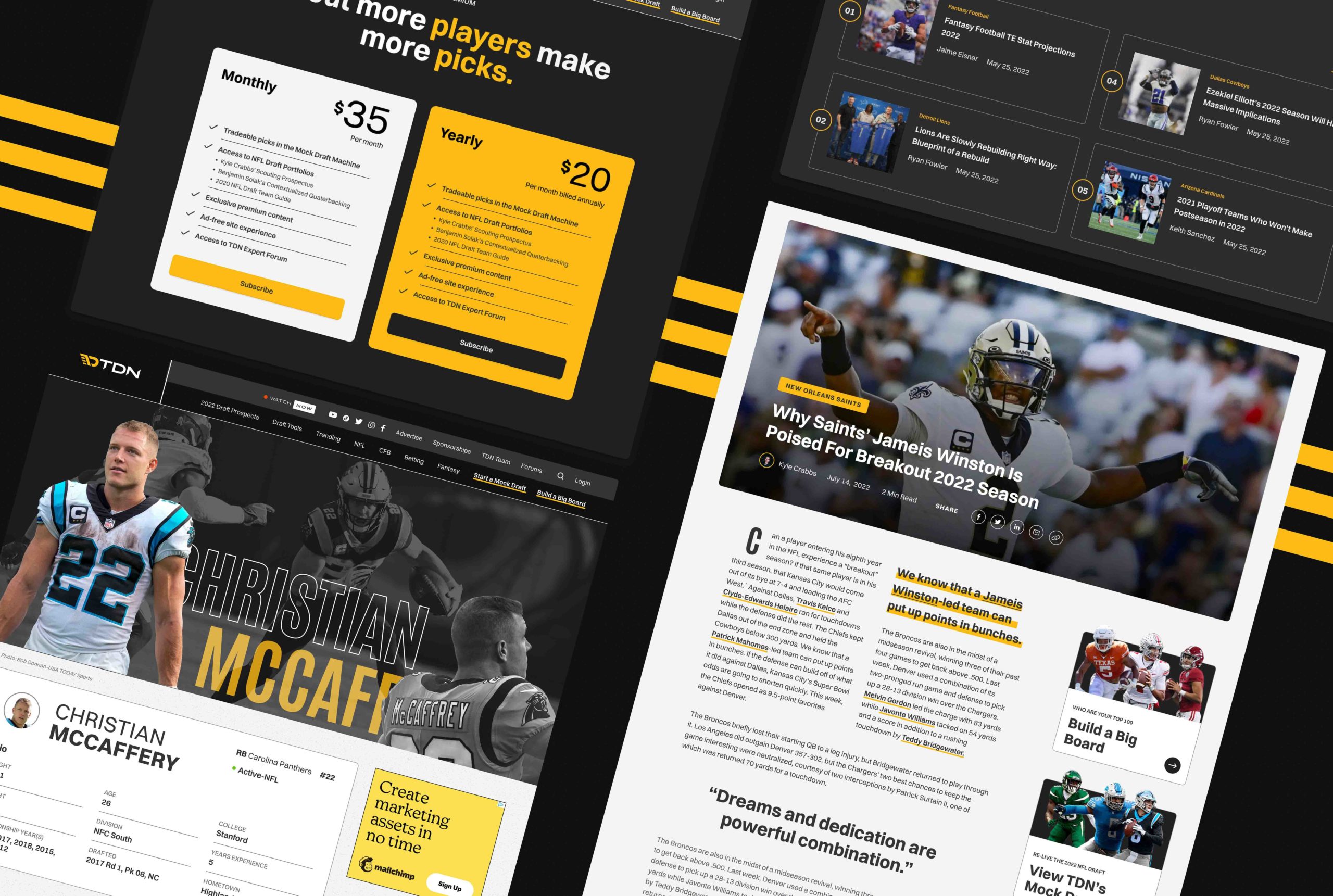
At Lifted Logic, we understand the differences between a desktop user and a mobile user. We offer mobile responsive website optimization in Overland Park as a standard part of our custom designs and our mobile sites offer excellent user experiences. We ensure that all the essential content adjusts to any screen size, from phones to tablets, and all the information is presented in a user-friendly way while retaining the qualities of our unique custom web design. To contact Lifted Logic and get started on your custom site design with mobile responsive website optimization in Overland Park, fill out the form below! We can’t wait to hear from you! (One of our mobile sites pictured below)

Lifted Logic
Lifted Logic is a team of creative writers, designers, developers, and photographers who specialize in digital storytelling. As a leading web design company in Kansas City, Lifted Logic works with hundreds of small, medium, and large businesses across the country every year.