The core of your business website is built on landing pages. You should treat them as the conversion rate optimization (CRO) engines that they are. The team of badass web designers at Lifted Logic critically think about landing page optimization statistics in order to deliver an experience that helps users convert. After all, improving conversions is sort of the whole point, right?
2 keys to the best web design for landing pages 🔑
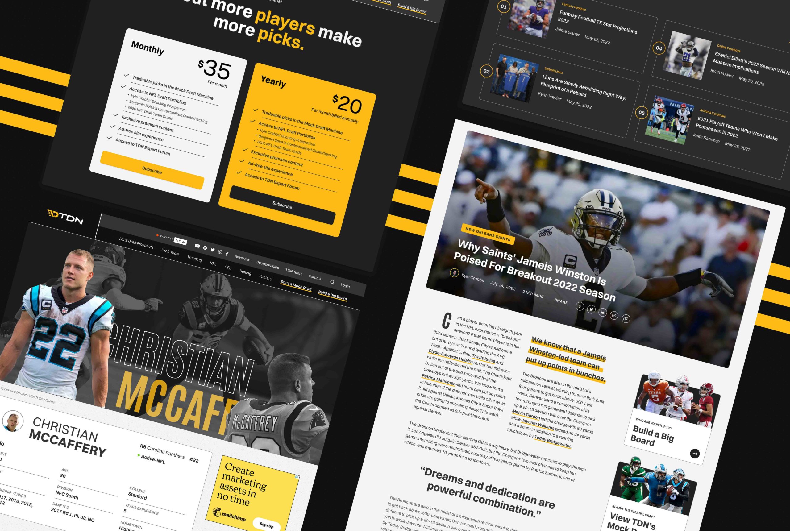
Over the years, we’ve done the best website design for Kansas City nonprofits, museums, ballet companies, a broad variety of corporations and small businesses—you name it, we’ve probably designed a website for it. So we know a thing or two about the best web design for landing pages.
1. Hyper target your landing page traffic
You may be tempted to send users directly to your homepage for everything; that’s not what we recommend. Instead, send users to a landing page with just one goal (like a newsletter sign up or a form). Taking navigation options off of your landing pages boosts conversion rates by as much as 100%. Y’know, just a measly 100%.
Basically, the fewer distractions on the page, the more conversions your page captures. One of the best practices for any type of design is to stop and consider what you would look for if you were in the user’s shoes.
When you go to a landing page and it’s got dozens of buttons linking you off to different pages, how likely are you to stick around and hunt down the one you’re actually looking for?
2. Create a landing page for each of your campaigns
A lot of marketers build a new landing page for each new campaign they run. Increasing the number of your landing pages from 10 to 15 increases leads by 55%.
When you math that up, you’ve got a 55% increase in leads + those leads are converting up to 100% more effectively than before = a lot more business.
Hyper-targeted landing pages capture leads because you can really speak to your specific audience.
If you’re a med spa holding a special on Botox and a special on fully ablative laser resurfacing treatments, those are going to pull different demographics. The language you use to engage with those different demographics should, while remaining consistent with your brand, speak directly to those different audiences.
Your Botox crowd will likely be younger and more likely new to the med spa game, whereas those who are interested in laser resurfacing have more years of damage to reverse. When those potential clients feel truly seen and heard by the content they encounter on your landing page, they’re way more likely to reach out.
The best landing page design in Kansas City
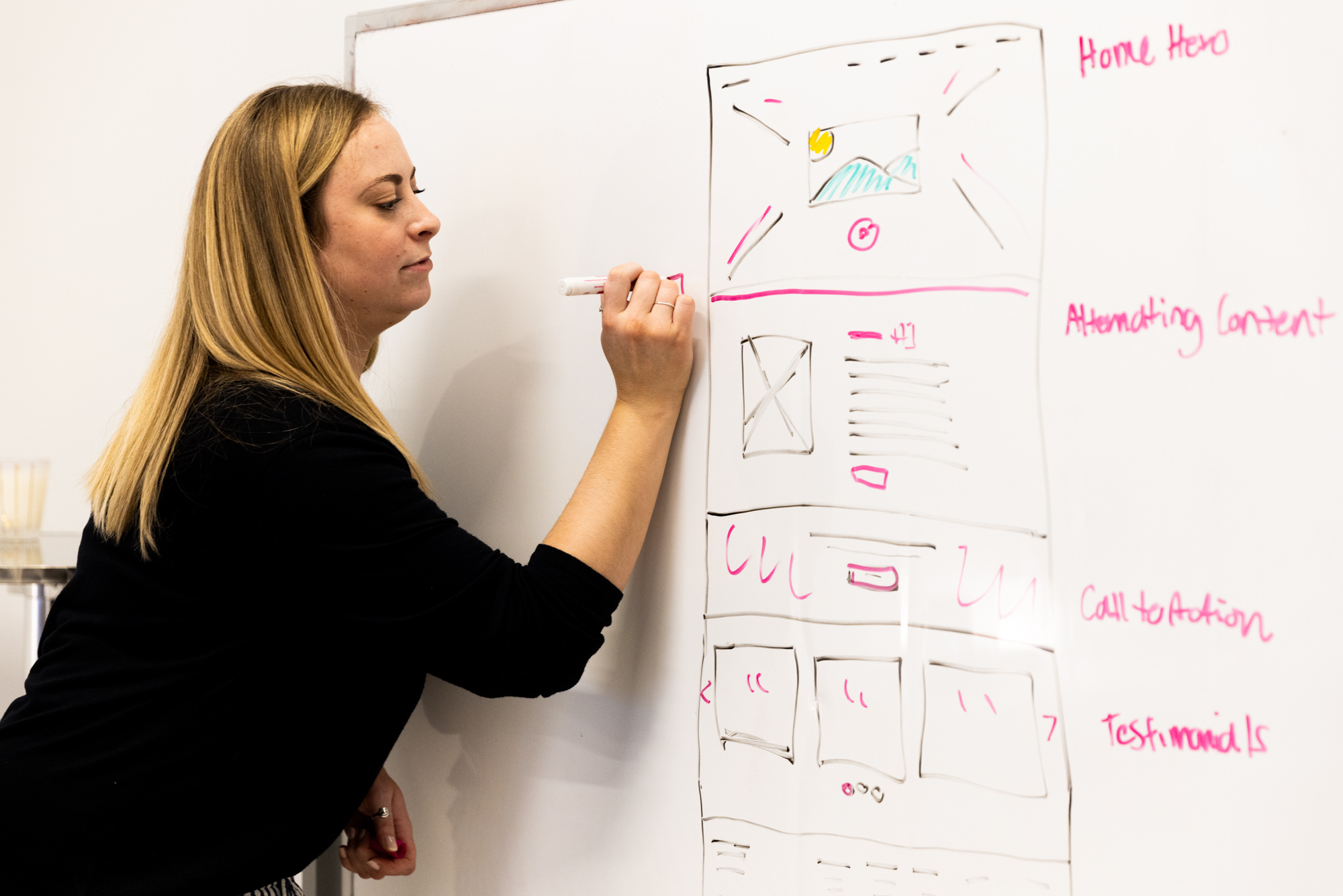
The web designers at Lifted Logic take the time to design thoughtful, intuitive, and gorgeous landing pages that will take your conversions to the next level. Web designers are the architects of your website. They use the principles of design to create timeless, functional experiences that deliver users seamlessly to their destination.
At Lifted Logic, we love to help our clients feel more confident and informed in their digital decision-making.
Sign up for our newsletter
If you don’t wanna miss a thing from the team at Lifted Logic, you should sign up for our newsletter. We’re bringing the best of our blogs, videos, and general web weirdness right to your inbox. We work hard to make sure our newsletters are fun, informative, and that they look sweet as hell. You don’t want us to think that’s all for nothing, do you? 😉
