The heavy hitters of entertainment streaming platforms—Netflix, HBO, and Spotify—are all doing something right: tailoring user experience to increase overall engagement. It’s why we as users keep coming back for more content on a consistent basis. Why we spend hours browsing and bookmarking. And why they make so much damn money off of users in the end.
There’s no telling the insights and perspective you can gain from streaming service design into how your own business engages and re-engages customers.
Now, we’re not saying you have to somehow create an “algorithm” for user-unique content on your company’s website design. But what you can do is pick up some of the strategies that these industry giants are using to increase engagement with your SEO content.
Lifted Logic is a Kansas City website design and development agency. We’re also experts on SEO, digital marketing, and copywriting; we write web content in a way that increases user engagement through search engine optimization.
There’s a lot that can be learned from streaming services and applied to your own website design ideas. Let’s review some of the features of streaming platforms that are most applicable for web designers.
Curate Your Content
By curate, we mean present your SEO digital marketing content in a way that appeals to your audience. You can have the best content ever, but at the end of the day, if it’s not presented well, it won’t spark interest or engagement on your site. Even if you do a great job with SEO optimization, users are likely to bounce from your site if the content is poorly curated.
Think of it this way.
When you walk into the Nelson-Atkins Museum of Art, you see gorgeous works of art (duh), but the experience is more amplified by the fact that you’re in an architectural masterpiece of a building.

The building’s oversized columns in the main hall and carefully organized galleries create an atmosphere that mimics the feelings the art itself invokes: contemplation, thoughtfulness, and beauty.
The same idea should be remembered with the content that you’re publishing. The content itself is great, and it should be curated in a way that commemorates its purpose.
This is where we can learn from video and audio streaming platforms that rely on user engagement with their content. They know that their content is only as good as the user experience within the service. Users will browse and stream if the content is easy to find and appeals to their interest.
So how do you curate content with your website design in the same way?
Have a featured content section
This can be configured to show the most recently published content or to show content that you manually select as the featured content. Either way, a featured content section at the top of a landing page is visually striking to users. Featured content also implies the publishing of new content on a regular basis.
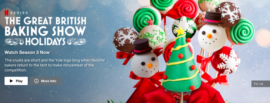 Netflix plays a video preview of featured content for each user at the top of the home screen.
Both regular site maintenance and new content can help the user trust that your site is relevant and informative, since you show an ongoing effort to keep it updated.
Why You Should Update Your Website →
Give the user a reason to view your content
Any snippet of information that the user can preview before opening your content is a good thing. Users want to know why they should click on the content in the first place. Taking the time to have a description appear to preview the content makes it easier for users to choose if it’s right for them.
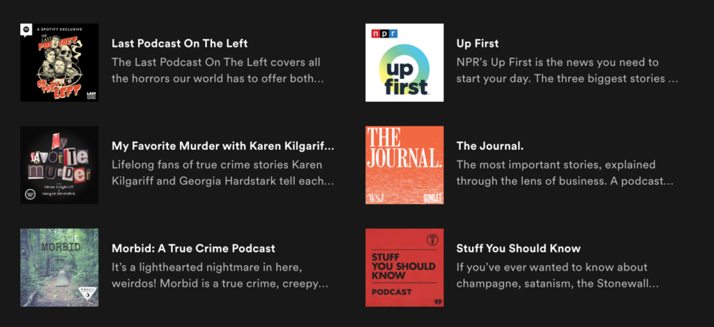 Spotify shows a preview of each podcast’s description on the Browse Podcasts tab.
 Use engaging buzz words in your titles and headers
Images are super important (we’ll get into that in a minute), but you should hook your audience with engaging text too. It’s easier for the user to choose a category that best suits their interests and needs if you have a clever and informative title.
Netflix has perfected this in recent years. Below are some examples from Netflix that go far beyond generic TV and movie category names.
-
-
- Ominous TV horror
-
-
-
- Soapy Romantic TV Shows
-
-
-
- Watch In One Weekend
-
-
-
- Suburban-dysfunction TV Comedies
-
-
-
- Oddballs & Outcasts
-
Get a better picture of what’s in these categories based on these words? I know I do. These category titles are engaging and informative about the content within them, using just a few descriptive words.
With engaging titles and headers, the user is able to find content quickly and easily. This makes for a better overall user experience.
Use categories/hubs
Our brains are better able to sift through information when it’s organized. The same goes for your website content, and using categories to sort the information is crucial for users. Instead of endlessly scrolling and reading SEO content titles, users can easily navigate categories and hubs to find content they’re interested in. You can even configure certain content to show up in multiple categories.
Whatever way you choose to categorize your content, make sure that it’s intuitive to use for the average audience member.
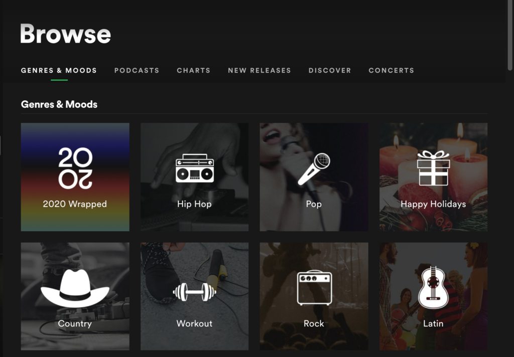 Spotify uses visual icons, relevant images, and simple titles for their categories.
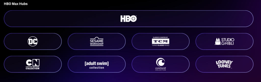
HBO has the usual category pages, but they also have a feature that shows the “hubs” of their content. This allows the user to browse through the content from particular studios that may appeal to their curated interests/taste.
I pulled examples from both Spotify and HBO to show you that there are a multitude of ways to categorize your content through website design.
At the end of the day, do what would make the most sense for the user browsing the content.
Tailor the artwork and visuals to your audience
If you ask most people, they will say they prefer to have visuals for reference when they’re learning and browsing through information. It engages their attention, creates more understanding, and people can usually process an image quicker than a paragraph of text.
Netflix uses visuals as its primary hook for users to choose a piece of content, and they’ve actually started tailoring which visuals different types of users see. Their advanced algorithm has gone through testing to get to know what types of visuals gain the most user conversion.
They’ve also analyzed what kind of images are most engaging for a broad audience. In 2014 Netflix conducted a consumer study that showed that artwork is the biggest influence for a user to watch their content; it made up 82% of a user’s focus while browsing their platform.
Below are some consumer trends of the types of images that spark the most user engagement:
Images that convey emotion
If an image with a person or multiple people is relevant to the content, choose a photo that shows the corresponding emotion for the content. If you’re talking about an issue that’s frustrating but the image shows a beautiful smiling couple by the seaside, something isn’t lining up.

Villains in an image
Okay, so you’re probably not writing about villains and evil characters, but you can showcase the “villain” if your content is addressing a solution to a specific problem. If this problem can be showcased visually, it’s a great idea to use that type of image.

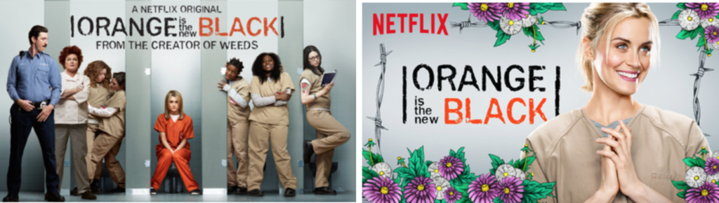
Images with one or two focal characters
Busy images with tons of people or cluttered space don’t visually read well when quickly taking in information. Netflix brought up examples of the images they used throughout the seasons of their show Orange is the New Black.
They mention that images like Season 1 (left) do well for billboards where there aren’t as many competing images. If you have a user for a short period of time while they’re browsing your site, less is more, as shown in Season 3’s image on the right.
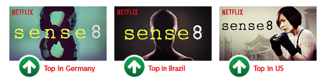
Different regions of the world prefer different images.
Depending on the reach of your company, you could take this trend in more than one way. If you’re national, you can think about the fact that your different audience segments may prefer different images. If you are worldwide, consider how you can strategically use images that reflect the values of audiences in different countries.
In short, you can use these consumer insights from Netflix to change how you think about using visuals in your content.
A pillar of good marketing is knowing your target audience. By understanding their likes, dislikes, and demographics, you can figure out how to pick the best visuals that will appeal to them.
How to Optimize Images for the Web →
Visit Lifted Logic for professional web design
In essence, the website design that curates your content is just as important as the SEO content itself. We can learn a lot from entertainment streaming platforms.
-
- Have a featured content section
- Give people a reason to view your content
- Use engaging buzz words for titles and headers
- Utilize categories/hubs for organization
- Tailor visuals to your audience
It might be a little overwhelming, especially if your business hasn’t written your own SEO content or thoughtfully showcased your content through website design.
We want to help you drive organic traffic to your site! Lifted Logic offers a free SEO evaluation for your business. We’re big fans of SEO digital marketing and website design, and we love sharing that knowledge with others. Schedule an SEO digital marketing consultation with us today.

Olivia Cusanelli, Assistant Department Manager
With a background in education, Olivia is Lifted Logic's go-to provider of SEO Blog Training to clients. That's on top of assisting them with brainstorming content ideas, keyphrase research, editing, workflow, and content department management. Once a teacher...