What We Did
SEO
Copywriting
Branding
Package Design
Web Design
Web & Mobile Development
API Integrations
Photography
Videography
Hosting
A New England Original
Cooper’s Cask Coffee, established in 2015 in Rhode Island, is known for their award-winning whiskey and rum barrel aged coffee beans. What—a client who understands the joys of great coffee and top-shelf liquor? Yeah, we fell a little in love with Cooper’s.
Cooper’s has invested deeply in state-of-the-art technology to make a precedent-setting product. Cupping, testing, refining roast times, using only premium quality, single-origin coffee beans from around the world—in short, these highly caffeinated men and women truly know their stuff.
They came to us for help stepping up their digital presence, and we gave them the works – a full rebrand with updated packaging to match, a custom e-commerce website, SEO content, and ongoing marketing services. Only the tastiest creativity would do for the bold flavor of Cooper’s identity.
Ideas Started Brewing
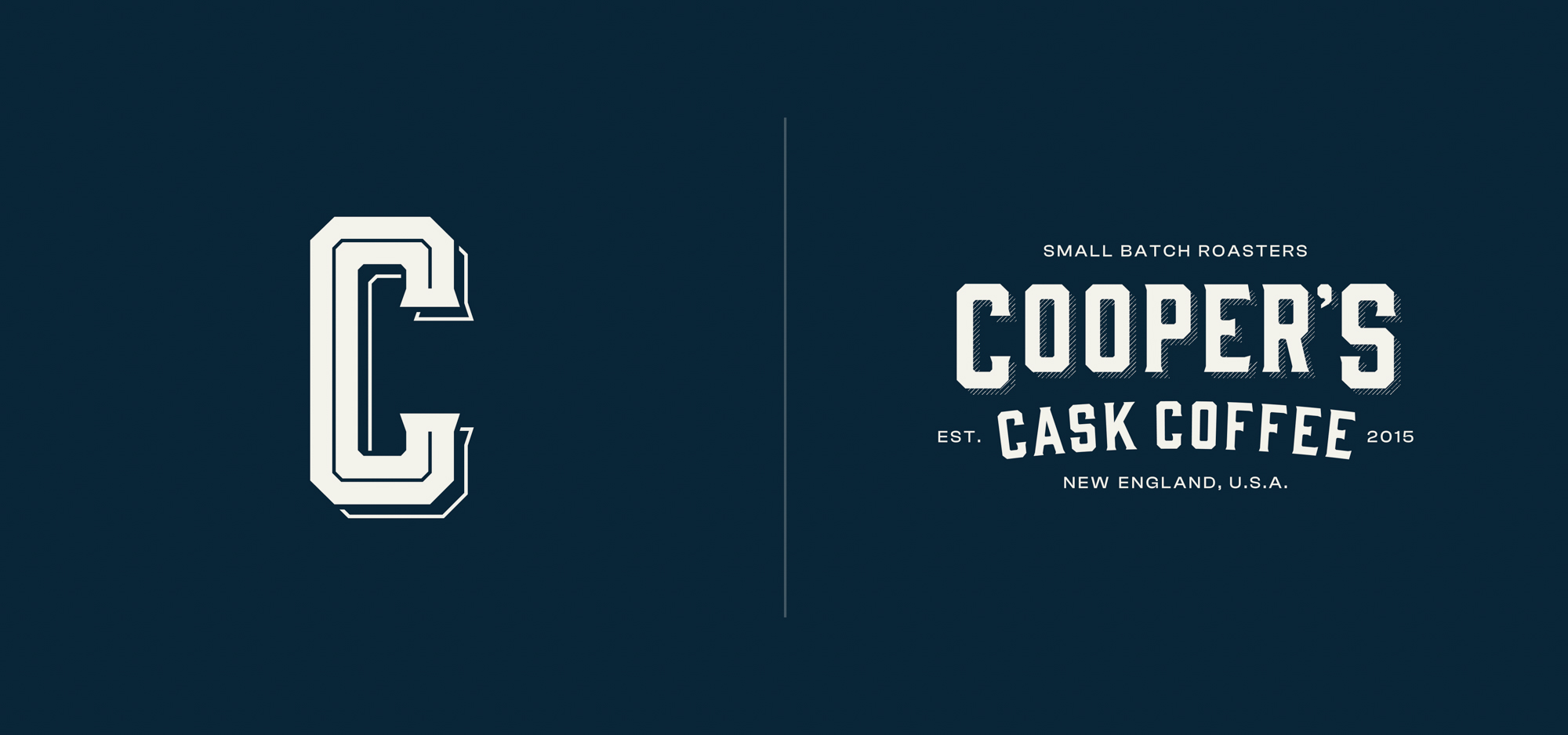
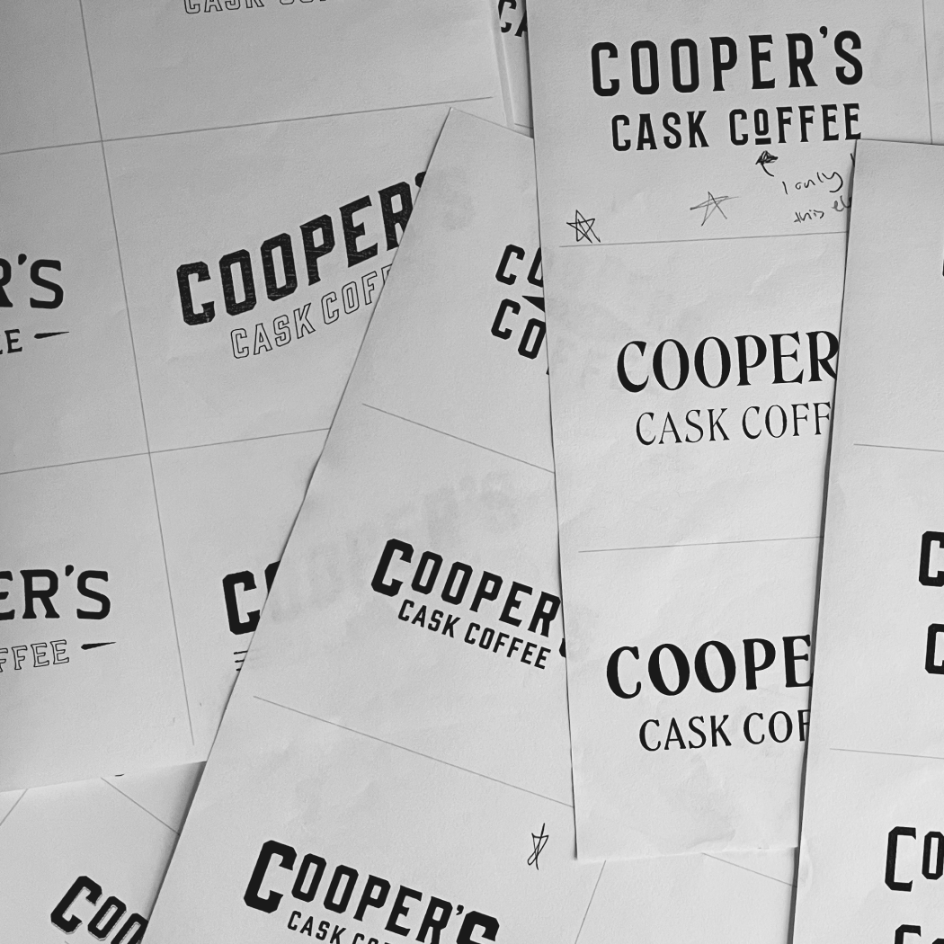
The Cooper’s rebrand story starts where all good stories do…with a new logo!
Our designers were inspired by vintage liquor labels as a nod to Cooper’s gourmet barrel aged line, and began exploring typography with a classic—yet elevated—feel.
Completing the logo design first allowed us to set a solid foundation, and expand the rest of the brand identity through the packaging and website elements.
A Brand is Born
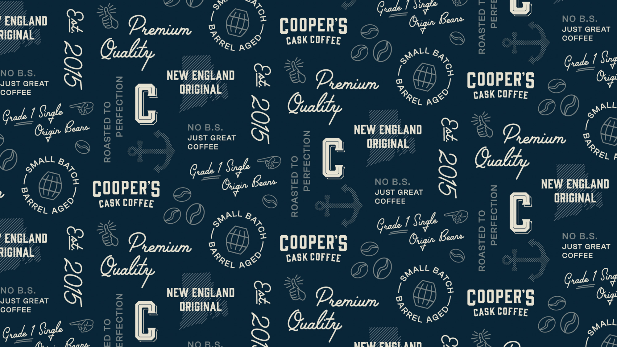
Understanding the personality of the product, along with the vision of the clients, helped us conceive their visual voice.
The brand characteristics needed to feel sophisticated and passionate—but with a pinch of masculine influence. Cooper’s barrel aged coffees are more of an experience, often saved for special occasions and not typically consumed as an every day coffee. We wanted the brand visuals to reflect that distinctiveness.
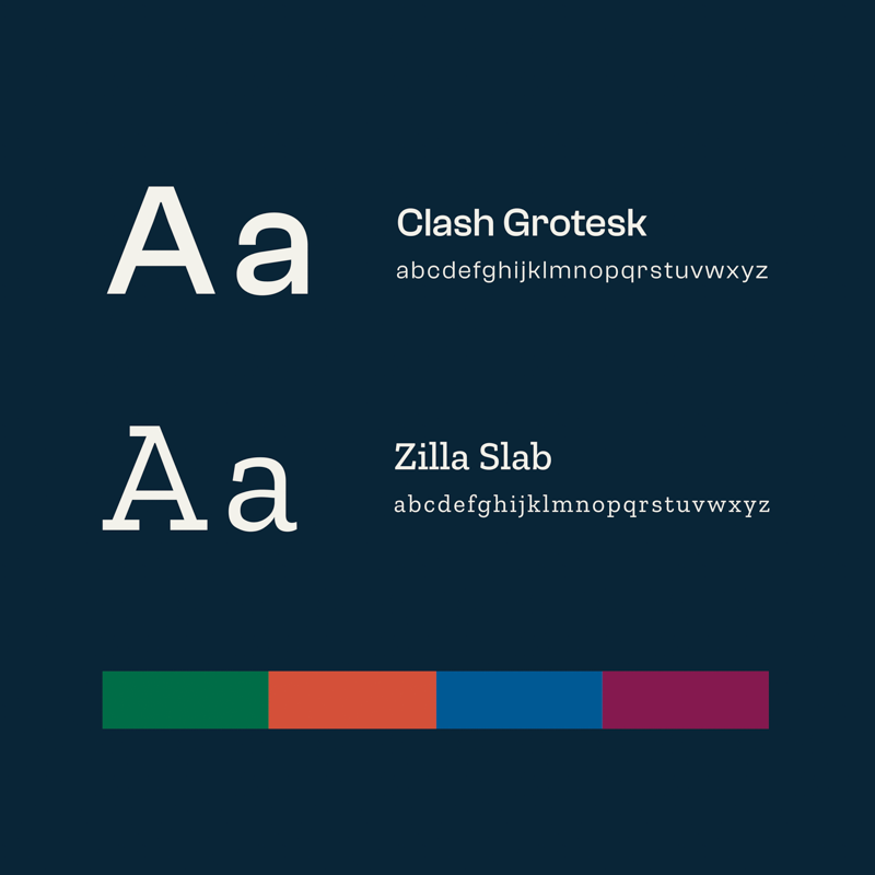
Our designers brought together a core color palette made of rich hues to pair with their bold flavor profiles.
Wrap Artists
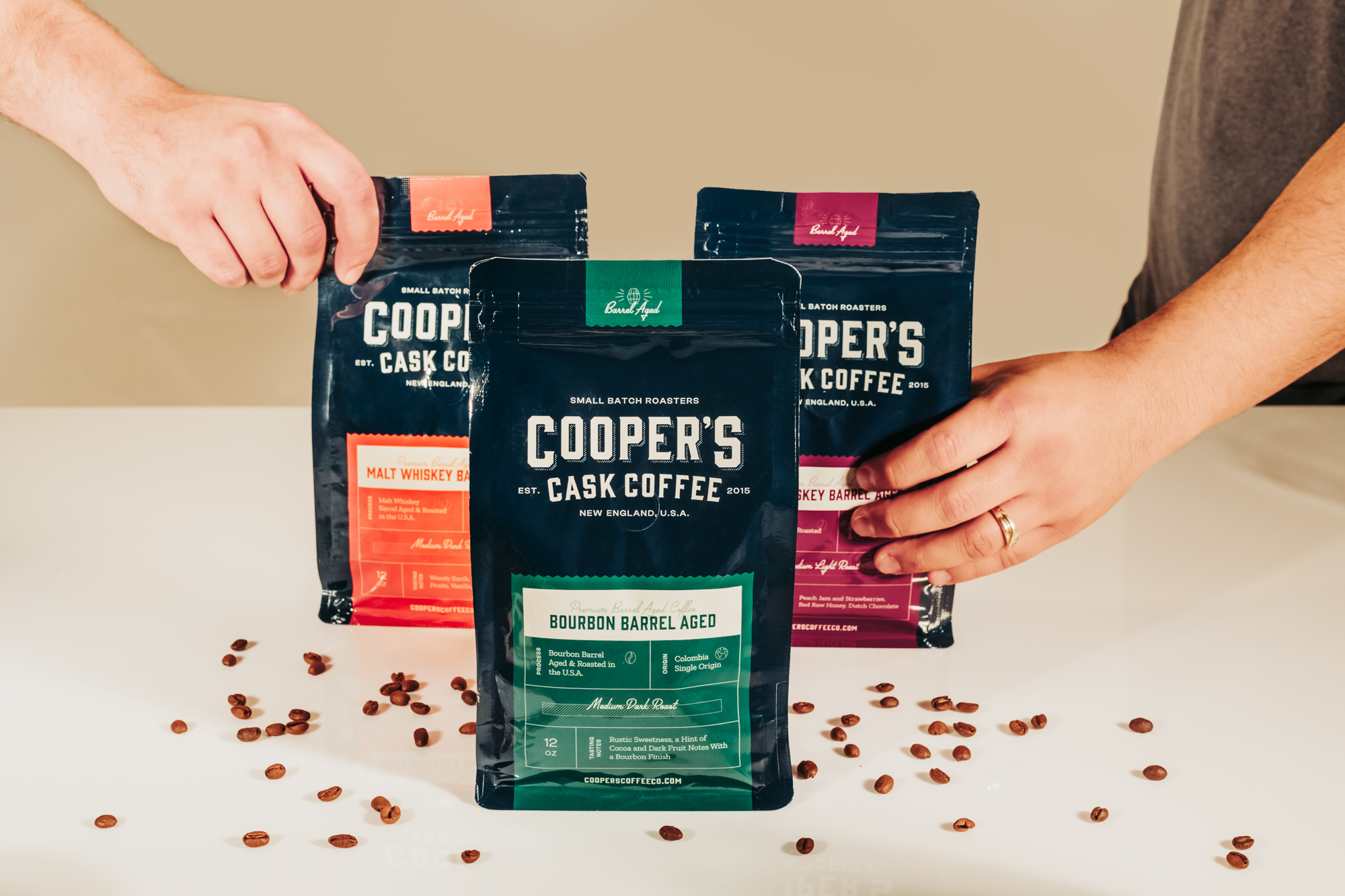
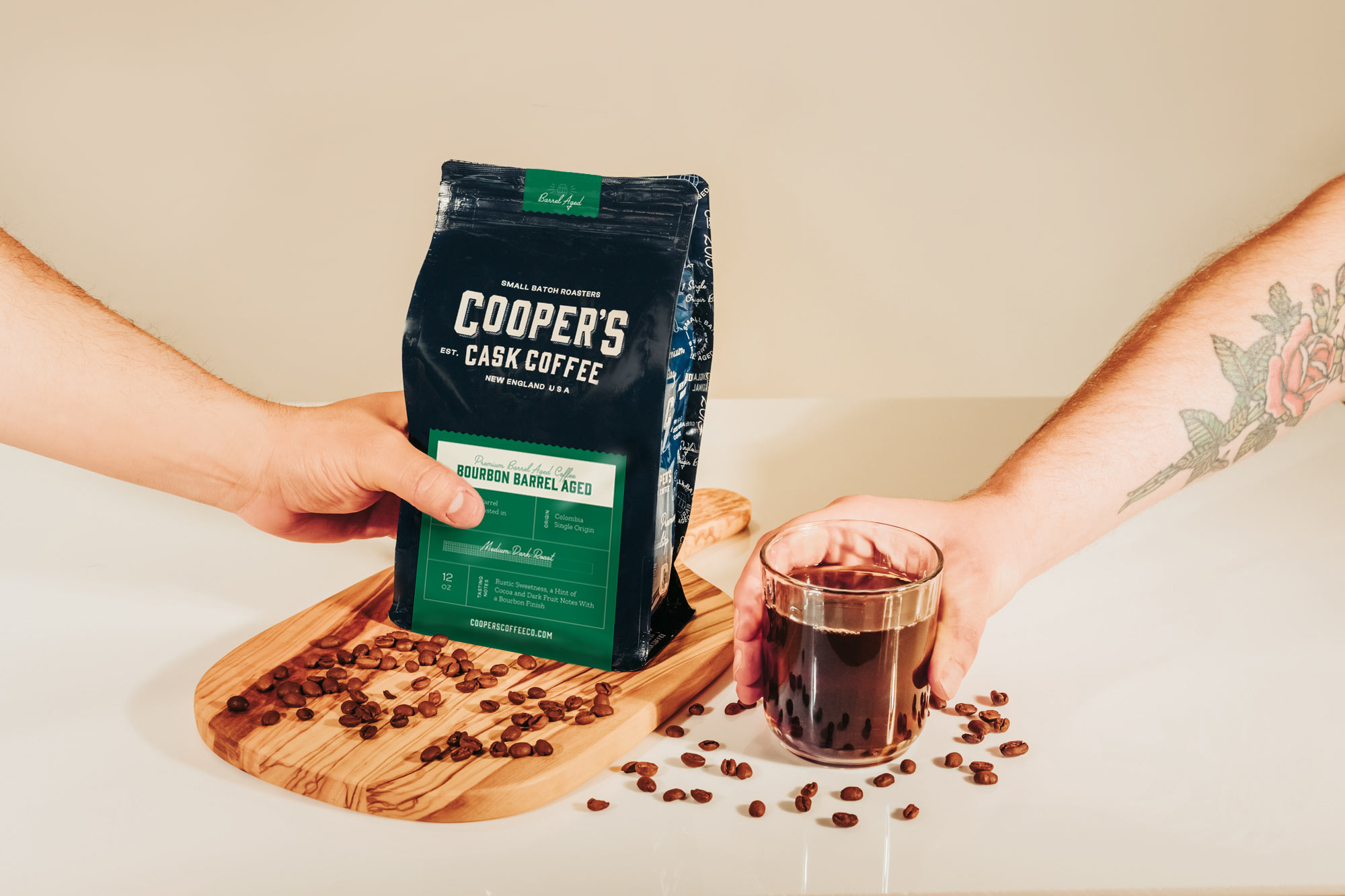
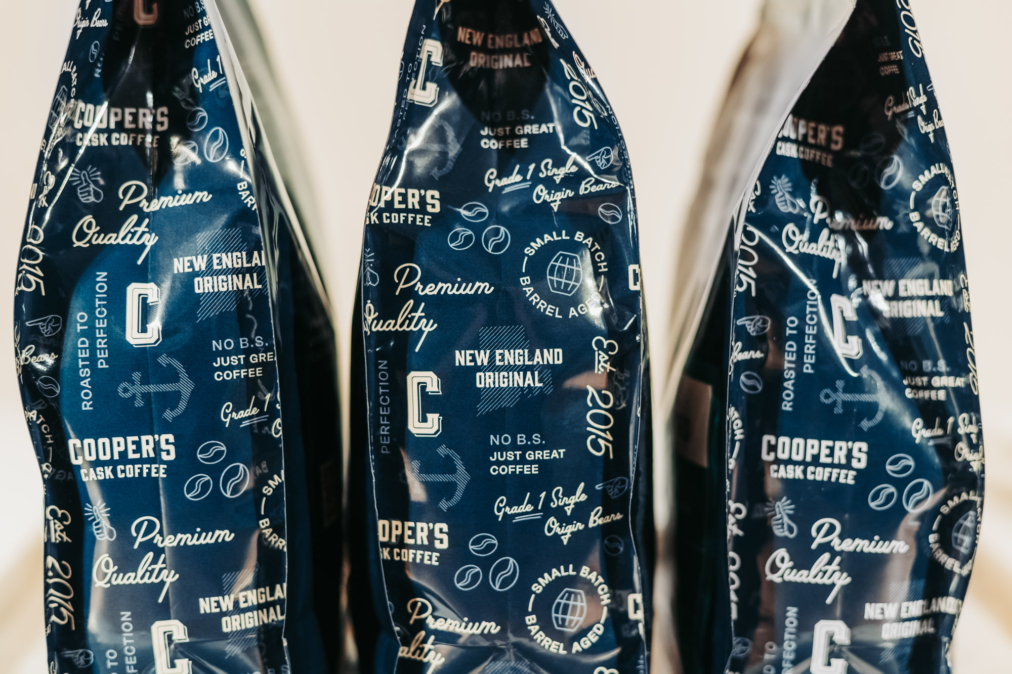
Cooper’s Cask Coffee’s coffee bags were updated to match the new brand aesthetic. The look and feel of these bags draws the eye, making them stand out among competitor brands both on-shelf and online.
We created a flexible packaging and label system that rolled out across their barrel aged and single origin coffee products. It can also accommodate Cooper’s private label customers, too!
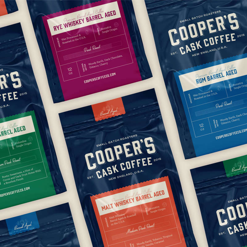
Labels + Iconography
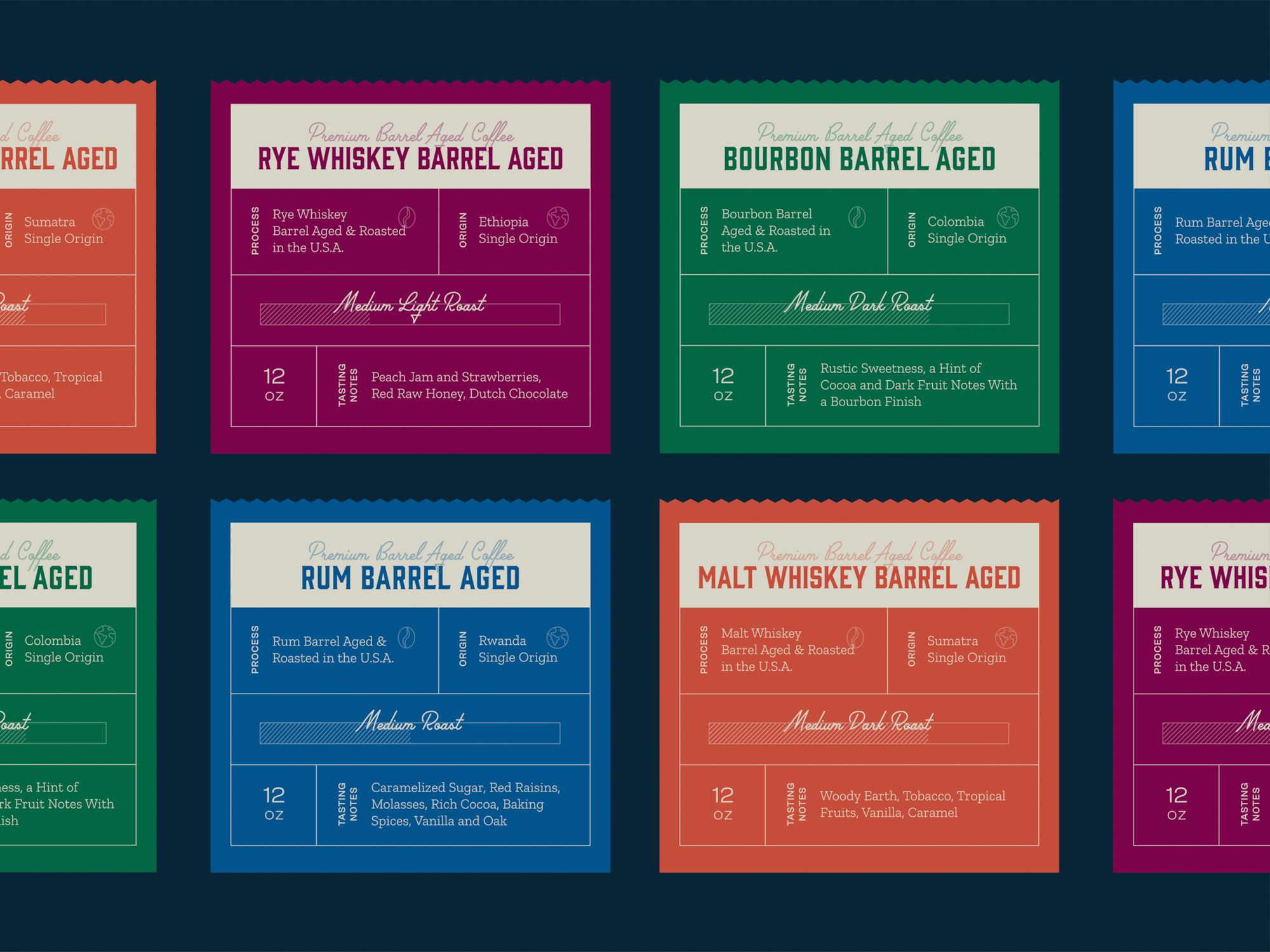
Part of the rebrand challenge for Cooper’s Cask Coffee is their wide range of premium coffee products. With this breadth and depth of delicious choices, it’s crucial that customers can quickly and easily identify which product they are looking for.
Additionally, there can be a lot of information on a single coffee label. Website users can gain knowledge on the tasting notes, origin, roast level, and recommended grind level of that bag of beans. Our designers developed a set of custom icons and labels to make these important characteristics more easily identified at-a-glance.
Scrolling a Hot Cup of Awesome
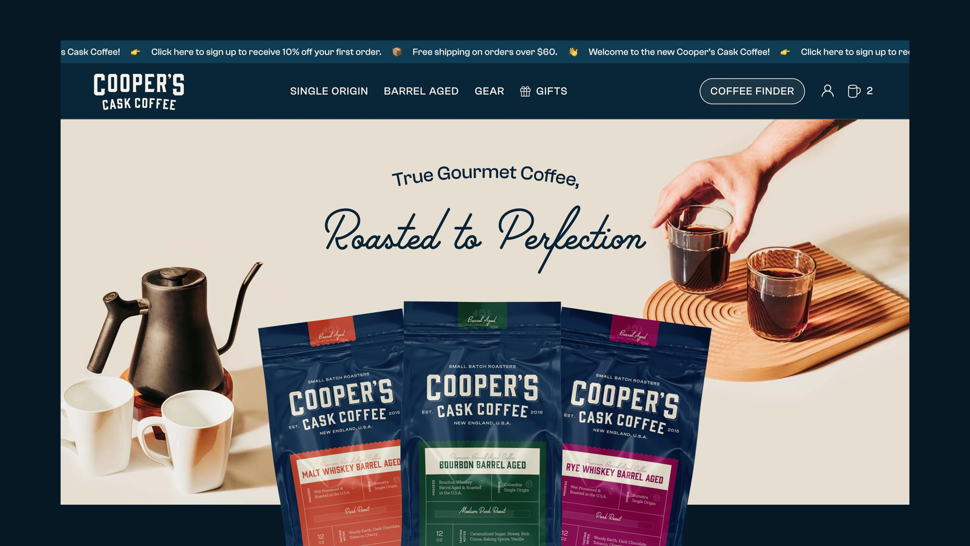
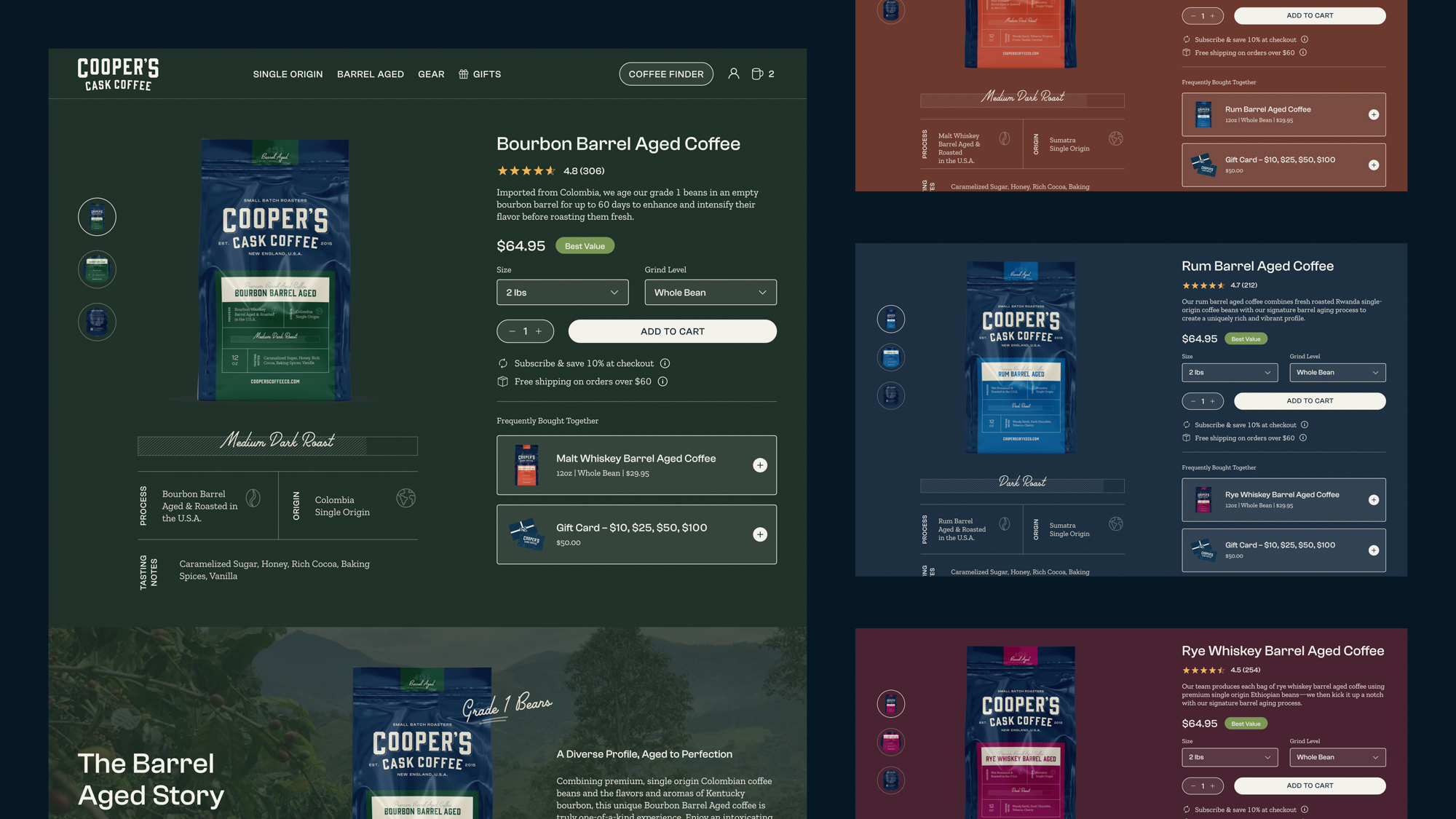
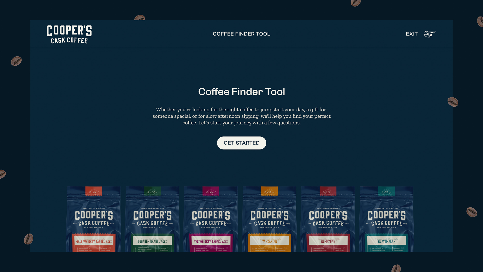
Finally, the rebrand rollout included a custom website design, complete with e-commerce shopping experience and an interactive “Coffee Finder Tool.”
Scroll-based animations and effects allow customers to interact with the Cooper’s brand in a way they never have before. All the design elements work together for a modern experience steeped in Cooper’s true voice.
SEO Content and strategizing allows the right users to find Cooper’s at the right time. And that right time, is coffee time!
Marketing, SEO, Socials, Espresso
After site launch, we continued our relationship with Cooper’s Cask Coffee with our marketing program, expanding their digital presence throughout social media, additional SEO content, and google ads.
And sure, we also bought an espresso machine for the Lifted Logic office because of Cooper’s coffee. Seriously, we did. #NoRegrets. It’s de-lish.
