First impressions matter. It’s 2019, and an overwhelming majority of people you’re trying to connect with are going to have their first exposure to your nonprofit organization on the web.
Lifted Logic helps nonprofits in Kansas City take charge of their web presence to ensure visitors are introduced to their organization in the best possible light. But how?
Our in-house creatives marry cutting-edge design with thoughtful content strategy for hundreds of clients each year to craft user experiences that resonate long after visitors leave our websites.
Keep reading to learn Lifted Logic’s tips for effective nonprofit web design in Kansas City and how you can nominate a deserving local nonprofit organization to receive $50,000 in donated work from our team!
1. Consistent Branding
Decide what your brand is all about, and then shout it to the world一consistently.

“Branding” is a broad term that encompasses everything from more tangible elements like your logo, fonts, and color scheme to loftier, more abstract elements like your brand’s values, mission statement, personality and voice, positioning in the market, and more.
Ultimately, all branding boils down to, “What story are we telling?” For a nonprofit organization, good storytelling is key to building valuable, lasting connections with visitors.
If your organization does not have the resources to hire a graphic designer or marketing department, you may consider using open source technology to get started.
For a cost-effective solution that brings professional results, you could also try a platform like 99designs or Fiverr, which can connect you to freelance designers from across the world.
If you’re looking for a full branding package, though, we’d be happy to help. Our content team can help you craft the perfect story for your organization, and our design team can help fill in the gaps with incredible visuals like a logo, font family, colors, and more.
They can then directly apply those designs to marketing materials like direct mailers, digital signage, and other materials to help your organization look and feel cohesive and welcoming.
2. Readable (Minimal) Text

A web page does not have to be filled with text in order to effectively convey a message (this advice does not apply to blog posts, but rather the main, static pages of your website).
In general, we find that most homepages and other landing pages across the web, especially for nonprofit organizations, are covered in entirely too much text.
While you may have a lot to say, there are lots of other ways to tell your story and convey the messages you want to the world than simply through words alone (as much as it pains the Lifted Logic writers to say). Keep reading for our suggestions on these other effective methods.
More tips for writing effective web content→
3. High End Videography & Photography

At Lifted Logic, we prefer to show, not tell. Is your nonprofit organization innovative because it has the most dedicated and passionate volunteers?
Do you have an amazing facility that your entire community benefits from? Let us show your website visitors what sets you apart through amazing HD photography and videography.
If a picture speaks a thousand words, then a video shouts a million more.
Let the world get to know you in your own words through imagery and watch how much your engagement, both online and otherwise, improves.
4. Clear CTAs

You’ve made an amazing first impression and showed a visitor why they should invest their time or money into your nonprofit organization. Now what? If your nonprofit website design is not conducive to instructing visitors what you want them to do, they may not be as likely to stick around.
Pull up your current website. If you can’t locate and click some sort of call to action (CTA) in less than three seconds, this is going to be a problem for your visitors.
Read: How to Find Donors Online
Online users are much less likely to convert without effective calls to action. Whatever it is that constitutes a “successful visit” to your website (e.g. donations, sign ups, etc.), make sure it’s very easy for a visitor to follow the conversion path.
There are a few ways to ensure your call to action is clear and easily found.
- The CTA is visible within the fold, or the first “load” of any given page on your site. Whether it’s a pop-up, embedded into the main navigation, or simply the first thing you see on the home page, a user should not need to scroll in order to know what you want them to do.
- The CTA contains an action word. “Donate Now” or simply “Donate” is going to be a lot more effective than “Donations.” The same goes for “Get Info” or “Learn More” versus “Information.” The list goes on. Whether that’s because of basic human psychology dictating that people only take action when instructed, or if action words are simply more engaging to users, this is one of the main ways we can sway a visitor to take action—through simple instruction.
- The CTA is clearly “clickable.” Whether the style of your CTA is a button or animated icon, make sure your CTA visually stands out from the rest of the content on any given page.
- The CTA is visible on every page of your website. A visitor may not have landed directly on the homepage to get to your site; maybe they entered the site on your About page, your blog, or a service page. Regardless of their entrance, you should factor in that a user only sees an average of 1.5 pages per session. Therefore, you should bring the CTA to them, regardless of what page they visit. Typically, this is achieved by placing the primary and most important CTA in your main navigation. This ensures you don’t miss out on putting this information or link on any of your website’s pages.
5. Mobile Optimization
We’ve been educating businesses on this for over a decade: if your website design is not mobile-friendly, your website has very little chance for success.
Nearly 60% of all web activity now occurs on mobile devices (phones or tablets). If you do not ensure your website visitors get the same experience across all devices, it’s likely your nonprofit will suffer in numerous bounced visits.
Google prioritizes mobile-friendly websites in searches, meaning now Google mostly uses a site’s mobile version for indexing and ranking. For example, if you work for a humane society and you want your organization’s website to show up when someone searches “pet adoption near me,” your information will have a much higher chance of being listed in the results if the site is mobile friendly.
You can easily check to see whether your existing site is mobile friendly using tools like Google’s Mobile Friendly Test or Page Speed Insights. For insights on the results of these tests, feel free to contact us.
Effective Nonprofit Web Design in Kansas City Explained
We hope these 5 tips have helped you better understand how to improve your nonprofit web design to be more effective.
Our Kansas City agency loves working with nonprofit organizations in town and across the country to educate them on best practices for the web and help them convert their web visitors at a higher rate than ever before.
If you have any additional questions about your website or effective nonprofit web design in Kansas City, we would happily act as a resource for you to improve your current site—or build a new one.
Looking for Effective Nonprofit Web Design in Kansas City?
We’re giving away a $50,000 website! Head over to our Code For A Cause page to find out all the details and requirements for nomination.
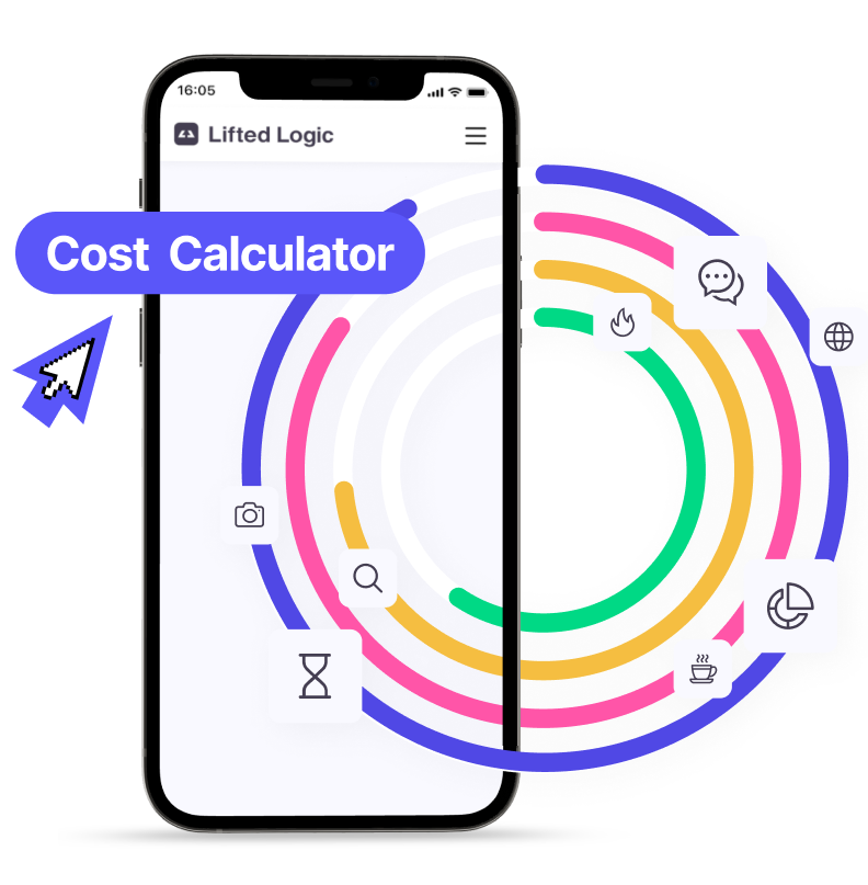
Curious about what the Lifted Logic team can do for your nonprofit in Kansas City – or elsewhere? Get in touch with our team today or use our Cost Calculator for a free website estimate!

Becca Stebbin, Lead Content Strategist
Becca was a Content Strategist before it was cool, building SEO best practices into digital marketing strategies for our clients well before it was an industry standard. Her experience at the forefront of digital marketing and SEO serves her well as the intrepid leader of Lifted Logic's Content Department.