


Good design can blow your mind. It can be impactful or subdued; funky or traditional; inspirational or relatable.
It speaks to the best parts of us, especially when it gets reflected back to us by the brands we love. From a business perspective, these emotions can become our toolkit to achieving highly customized and engaging graphic design work for our clients.
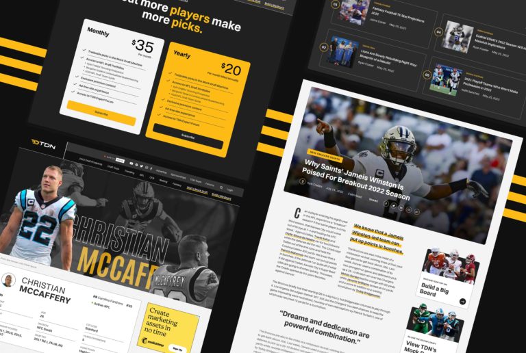
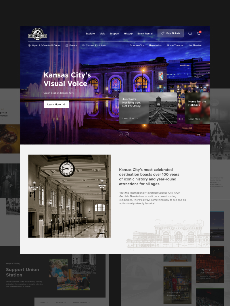
Check out some of our recent design work.
Lifted Logic designs high-end, high-functioning websites for everyone—from startups and non-profits to international corporations.
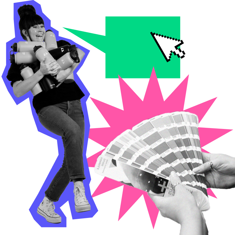
Don’t say we didn’t warn you.
Whether you’re mailing postcards or deciding which colors to use in your brand kit, we can’t understate the importance of good design (emphasis on good). The website design team at Lifted Logic can help you put your best foot forward on the web and beyond.
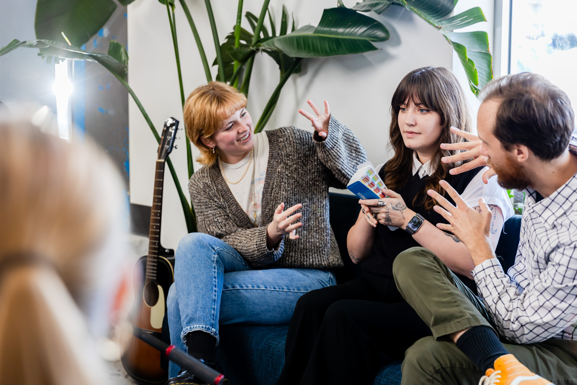
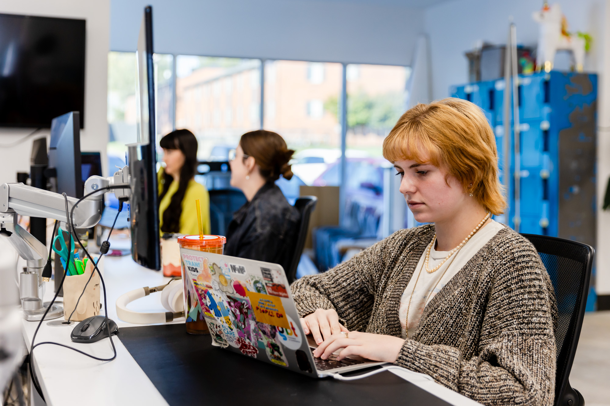
Our graphic designers are highly educated and experienced badasses who continually blow us away, project after project, with their design skills. When it comes to a website design, a lot of our clients like to ask us about pricing & cost. That’s because most website design agencies find it difficult to quote out design work. Lifted Logic understands the importance of keeping smart, talented graphic designers on staff.
It helps our projects grow. And it helps YOU beat out your competition.
But there’s no shortage of graphic designers in Kansas City.
So why go with an agency for your design needs?
First, and to be totally honest, freelance graphic designers can be flaky. We love and support them all the same, but damn, sticking to deadlines for artistic types can be more challenging than some may realize. Having a structured design process in place, along with amazingly talented project managers and the discipline of an agency, can help us complete your project more efficiently—which can actually save you costs in the long run.
Second, because our scope spans so many various industries, our graphic designers have experience with just about any situation under the sun. Need your logo tweaked? Done. Need a direct mailer designed? You got it. That’s fine and great, but try asking a freelance graphic designer to design a fully optimized, easily editable website with an attached CMS, advanced dev notes, or a custom dashboard. It’s hard. Schools don’t teach website design. Did you know that? (Side note: should we open a school for website design? 🤔 Asking for a friend.) That’s an important note. Because without the resources or education to understand the website design process, there’s a lot of things that can go unchecked or missed altogether.
And last, we do not build our website designs in a vacuum. Our designers have years of experience not only honing their design skills but also learning from our content & development departments to understand the “big picture” when it comes to a website’s design. They understand your ultimate goals (i.e., converting users into leads), how to incorporate SEO best practices, and how to make sure you’ll have the function and components to expand your website on your own after launch. So project after project, they have proven to fit into a perfect “website design sandwich”—the glue that brings beauty, storytelling, and function together.
Glad you asked 😉
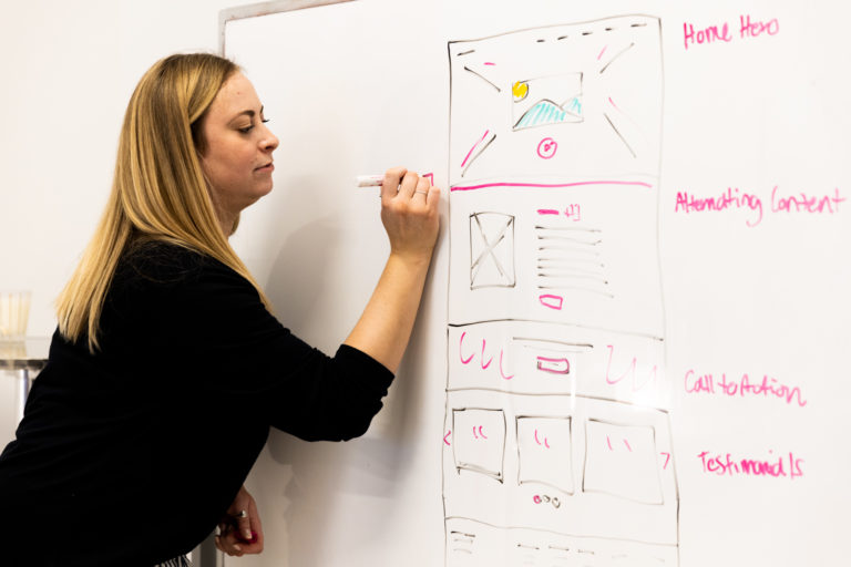
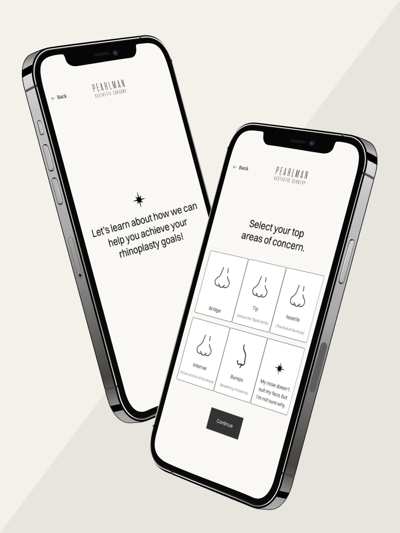
It all starts in content. Once your content outline (or sitemap) has been built, researched, optimized, and approved, it gets to the fun part. Our design team functions primarily in two phases when designing a website (or app!) for a client.
The first is an initial design phase, where our designers get together with the team leads of a project to brainstorm ideas, discuss the content outline, and make note of your overall functionality needs & business goals. After our graphic designer has a good understanding of the project, she puts together a mood board. This will include a variety of examples of various design elements and website examples from all over the world, specially curated to present to you and your decision makers in order to take a fine-tooth comb to your design preferences. Do you prefer a fly-out navigation or a horizontal one? A dark background or a light background?
During this phase, we will also determine whether we need to design your website on a standard desktop layout or if we should take a “mobile up” approach. Choosing to design a website from mobile up to desktop simply means that we lay out your website’s design based on what will work best on a phone FIRST. Typically, if your website traffic is 55% or more mobile in the last year, and/or your existing users tend to convert better on mobile, we may recommend starting with mobile design.
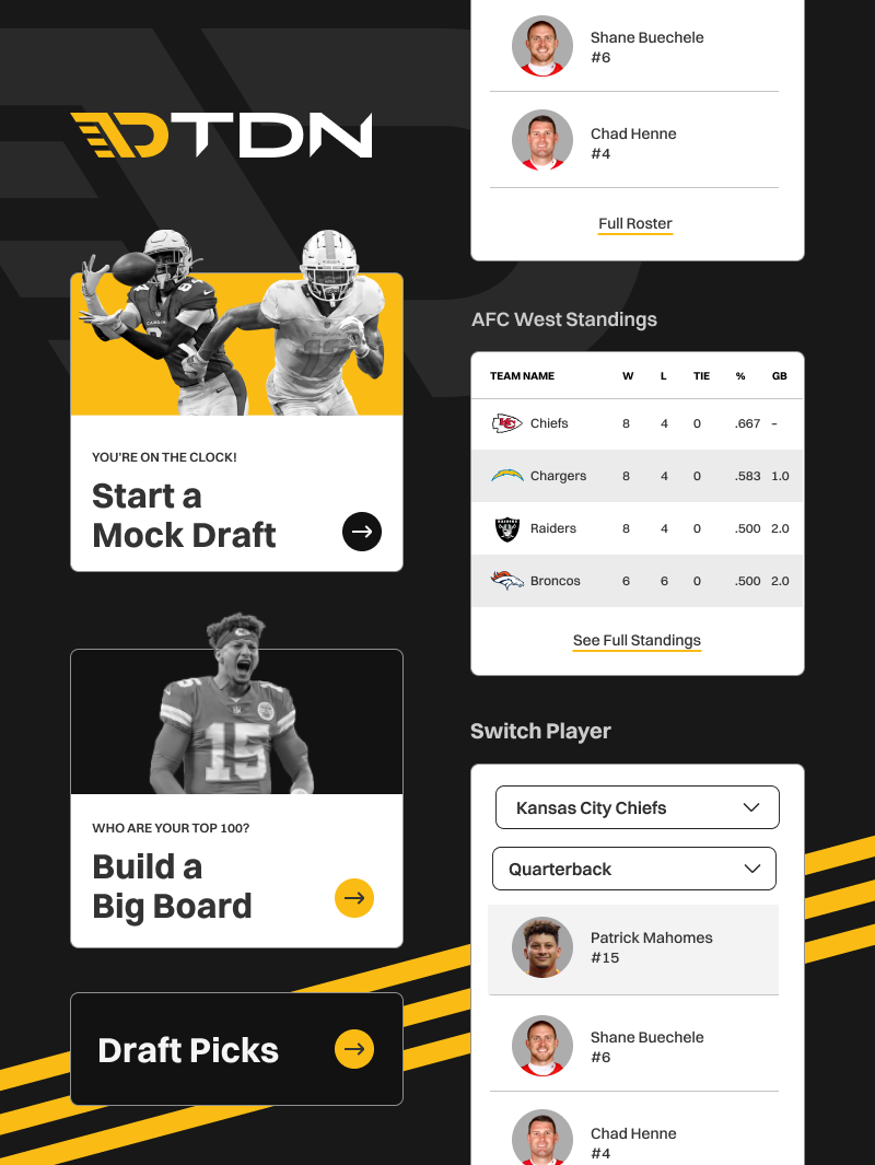
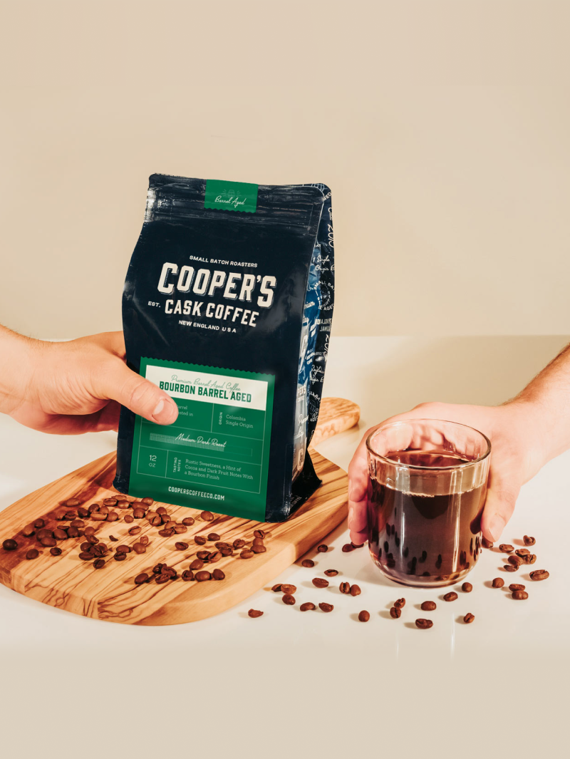
The second phase of the website design process is the fun part. You sit back and relax while we design a fully fleshed out prototype of your new website. We design the navigation; the various components on each of your unique website pages; the text styles; background colors & patterns; and even the photos (yes, our designers curate shot lists in collaboration with our photo & video department).
Once our designer is happy with the prototype of your new website design (or website redesign, if this isn’t your first rodeo), we’ll present it to you, giving you all the information you need to understand how the website will look and function. It’s usually the “aha” moment people have been looking for in their website design process. In those meetings, we hear a lot of “oooooohh”‘s and “NAILED IT!” Don’t get us wrong, we also hear a lot of “what?”, too. So as we present your website prototype, we’ll address any and all your questions or concerns. Don’t like a color or component? Shout it out and don’t be shy! Hearing what you hate in web design is just as important as understanding the things you love.
Around Kansas City, we’re considered one of the top website design agencies. It’s a big title, but we’re proud and humbled to wear it. At the same time, it can be a burden. When you have this many talented people in the same room, cranking out website design project after website design project, but with the capability of doing so much more, how do you let people know what you’re really capable of? (Hint: a new website is a good start.)
It’s a running joke amongst marketing agencies that we market everyone but ourselves. We’re no stranger to this. That said, we think it’s about time to step up (shout it from the rooftops if we have to) that our team doesn’t stop at “website design”—and we never will.
Our graphic design services have always included more than designing websites. Our team can create killer brand standards, memorable logos, engaging print collateral, branded digital assets (for use on social media, digital ads, and beyond)… We could go on. But we’ll say this: we would love to work with you on ANY of your graphic design needs.
Contact Lifted Logic for more information about our graphic design services in Kansas City. We’d be happy to get you a quote for your next design project! And if you need a bit more help than that, we can sit down over coffee for a free 1-hour consultation to discuss your struggles and your successes in the digital space to help you take your business to the next level.
We don’t employ sales people and we don’t focus on sales. Instead, we focus on honing our craft, learning constantly, and building strong relationships. And even though very few of our clients ever see it, we take immense pride in our code, how it’s organized, how lightweight our websites are, and how well the code was written. Basically, we take pride in our work.
Lifted Logic’s team of talented, award-winning web designers are here to voice your business’ unique brand to the world. We design highly visual, custom websites that evoke emotional responses in order to truly captivate an audience entirely in-house, using the latest in technology and design trends to truly make your business stand out from the rest.
When Lifted Logic designs your website, we want users to have the same emotional response they’d have when they walk into your office. It’s likely that many others out there do what you do, but no one else can serve your customers quite like you.
When you get down to it, every aspect of your website and brand must be consistent, and it all starts with design. Old or young, wealthy or thrifty, tech-savvy or not, your website’s design will attract and compel users to convert into loyal customers. We design our websites to be highly visual to truly connect with your users. With beautiful HD videos and gorgeous professional photography by Lifted Logic on your website, users will be compelled to become your client.
While obviously playing a role in conveying your brand and values, web design also attributes to other important aspects of your business’ online presence, including, but certainly not limited to:
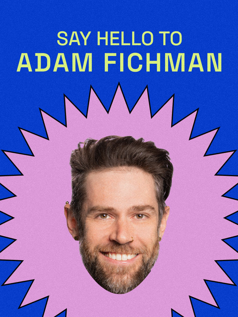
Designer Spotlight
Hannah is one of the most senior employees at Lifted Logic. For over what feels like 200 years, she has designed cutting-edge websites, pushed the envelope of UX/UI in the industry, and mentored a variety of other employees on web design best practices. She typically focuses on functionality-heavy projects such as dashboards and other websites where sophisticated user flow is necessary.

You’ll often find Hannah cuddling with her dog Murphy, while experiencing FOMO about how awesome the 80s must have been.
News
Lifted Logic has managed web design projects large and small for over a decade. We’ve honed our process to not only ensure an engaging and well-strategized product, but to educate you through every step of the way.
Whether you still have questions or you’re ready to get started, our web development team is ready to help.
While our day-to-day wardrobe at Lifted Logic may be a little more lax, our team still understands corporate culture and can turn out a great corporate web design that will make your boss think you deserve a raise just for finding us! What we have found in creating corporate web designs for a range of Fortune 500 companies and other big businesses is that collaboration between creative and corporate can lead to an end product that will be the envy of all your competition.
We get to know your company, its culture, and your overall brand and work to infuse it into every aspect of your corporate web design, all while refusing to settle for anything less than the best. Just because you are a corporate entity does not mean you should be limited to a stale corporate template.
Lifted Logic’s designers are constantly working to create innovative and fresh web designs that elevate our corporate clients. We can push the envelope appropriately to ensure that no one else out there will have a website quite like you.
Let’s start with the question we know you’re dying to ask…what is UX and UI? User interface (UI) is the saddle, stirrups, and the reins while user experience (UX) is the feeling of elation you get from riding the quarter horse at the grocery store, pretending to be a cowboy (don’t act like you haven’t done it before). Despite how easily we just broke that down, UX and UI are the source of tireless brainstorms (and heated debate) among the Lifted Logic designers and developers because of the impact they can have on a website’s success.
When the Lifted Logic designers sit down to build a website, they spend a significant portion of time simply sketching out the site and thinking through how the user is going to interact with each frontend design. After some sketch voodoo has been worked, the developers are dragged from their magical cave of coding to help critique the various aspects of the website and even argue over the shade of blue and fonts that were used simply because that one makes one “feel happy” or “seems easy to use.” While this sounds monotonous, it is all part of the completely necessary process of frontend UX/UI design.
The whole goal for your website is to convert visitors into loyal clients, right? UX and UI are the keys to making your site’s visitors feel like they are riding that epic quarter horse at the grocery store. When visitors have a memorable visit to your website, whether it was how it made them feel or the ease of use they experienced, they look forward to to working with your company time and time again!
We outline the navigation, functionality, the photos and video, and content all before the designers even open Photoshop. This allows our team to all get on the same level of understanding to foster the smoothest transition from person to person during the entire process of turning a website idea into a reality. Plus, we offer design and development check-ins for our clients to perform design and functionality reviews, along with user testing, and input from the client and its customers.
While you may have landed on this page looking for user-friendly web design, the Lifted Logic team feels that there is so much more than just design that goes into making a website that people enjoy being on. When creating a website, businesses have to think about their users at every step; from the design to the content, the navigation, the functionality, and the hours of planning in between.
Here are just a few of the ways that we always check to ensure the most user friendly experience possible:
What we have found in creating corporate web designs for a range of Fortune 500 companies and other big businesses is that collaboration between creative and corporate can lead to an end product that will be the envy of all your competition.
After hours upon hours of designing websites from scratch, Lifted Logic has learned that there is one constant associated with web design: nothing kills users’ web experience like stopping to think, “This looks a lot like (insert other lame website here).
From single products, to digital downloads, multi-part systems, and all that’s in between, the Lifted Logic design team takes the guesswork out of creating an e-commerce web design that your customers will love to use.
Lifted Logics designers are experienced in creating high end visual experiences, tailored to your business.
With the increasing diversity of internet-accessible devices, responsive web design, or as Lifted Logic calls it, just web design, has grown beyond static sites for specific screens or devices.
While you may have landed on this page looking for user friendly web design, the Lifted Logic team feels that there is so much more than just design that goes into making a website that people enjoy being on