Does your logo look as good as you think it does? Lifted Logic presents the biggest logo design mistakes: tips from a Graphic Designer in Kansas City.
Logos are arguably the most recognizable component to your business. Think about that. When you look at two golden arches, without even seeing the name “McDonald’s” you already know what restaurant it is and what type of food it serves. Your logo can have the same impact. However, many business’ do not see the importance of their branding and choose a generic, boring logo design. With this in mind, Lifted Logic is elated to help our clients identify the biggest logo design mistakes: tips from a graphic designer in Kansas City.
3 Biggest logo design mistakes: tips from a graphic designer in Kansas City
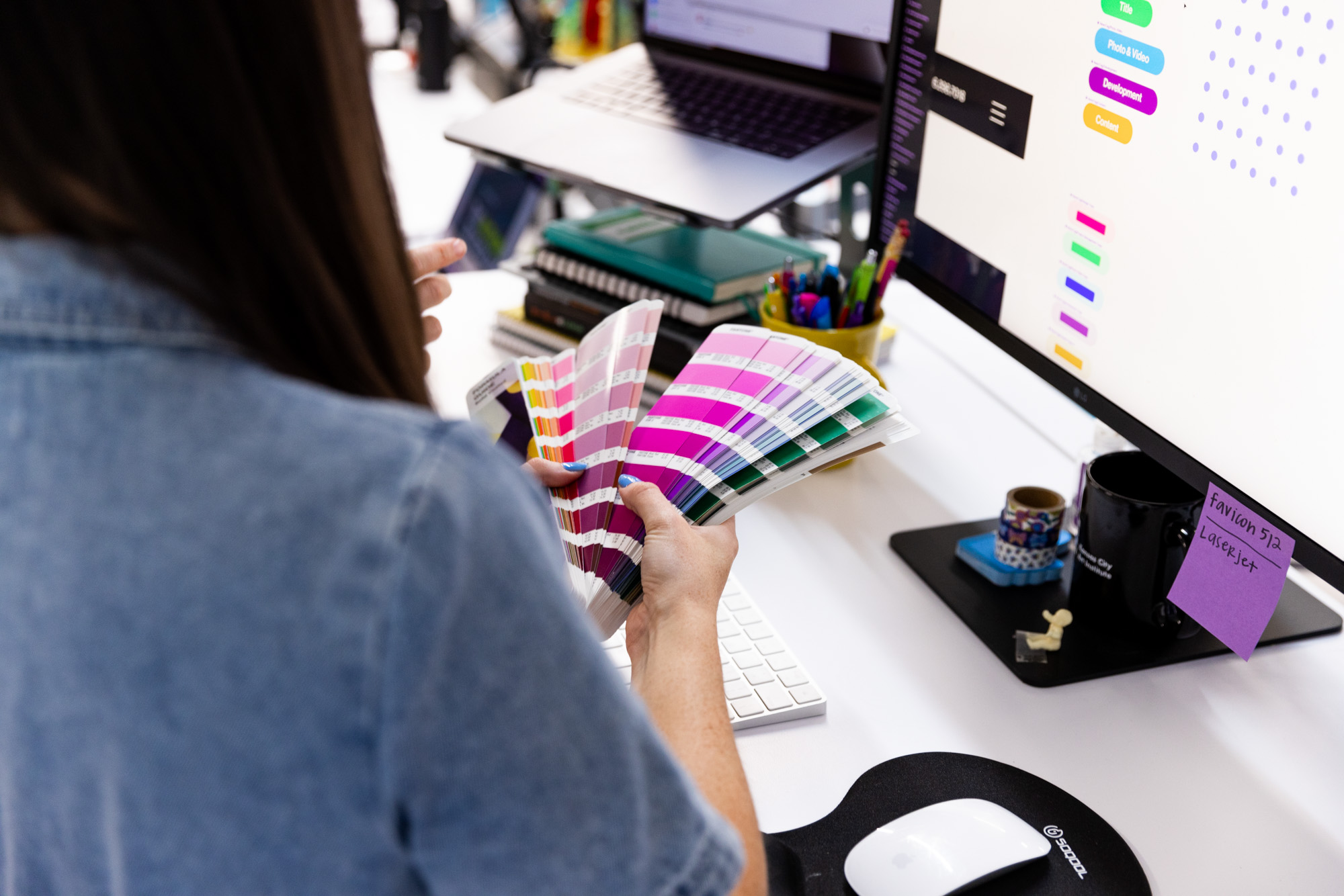
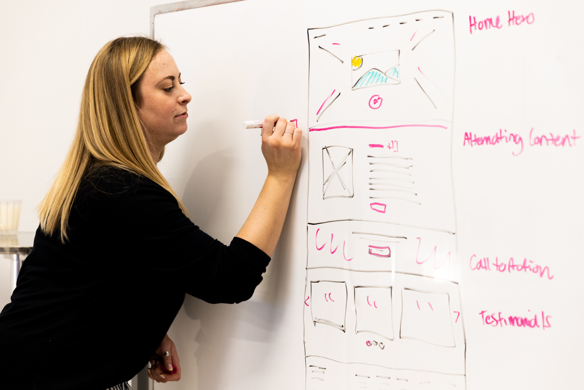
As professionals with a creative eye, our graphic designers can think of a range of common logo design makes but the following three are the most offending:
- Lack of originality: If your logo looks like everyone else’s, how are your clients going to remember who you are? By going with what everyone else is doing, you will ultimately be hindering your business. Find a design that represents only you and your brand.
- Too many typefaces: Logos that contain too many fonts do not look flattering. It comes across as unorganized and does not showcase your expertise. Choose 1 to 2 fonts that complement each other and stick with them.
- Too noisy: Do not be the brand that uses to much “cute” stuff in their logo. Clients can become overwhelmed by logos that have way too much going on. Simple and classy can go a long way when it comes to your brand.
Learn more about our branding and design services by clicking here.
Does your logo contain any of our biggest logo design mistakes? Contact the Lifted Logic team today!
Lifted Logic
Lifted Logic is a team of creative writers, designers, developers, and photographers who specialize in digital storytelling. As a leading web design company in Kansas City, Lifted Logic works with hundreds of small, medium, and large businesses across the country every year.